
Two new dashboards released to assist with drug shortage research
Flashlights in the Dark
As our global community hunkers down and grapples with the COVID-19 pandemic, those of us that are fortunate enough to be able to meet our family’s basic needs must immediately turn to how we can help others. For some, that may be donating money to organizations that are actively working to feed the many food insecure children severely impacted by school closures. For others, this may mean offering to pick up food for your elderly neighbor so they don’t have to go out to the grocery store. Whatever this looks like for you, thank you for your efforts to turn fear into compassion. It’s the least we can do to bolster our collective resilience.
Late last week, the 46brooklyn team started thinking about how we could shift our efforts and use our platform to provide some more help during this time of crisis. With most of our generic drugs made in China and India, concerns about drug shortages are naturally rising. Unfortunately, no amount of data analysis can systematically pinpoint which drugs are at highest risk of shortage. That’s because information on where the active pharmaceutical ingredients (APIs) in our drugs are made is not publicly available. We must place our trust in the FDA (who clearly has this information) to do everything in its power to maintain ample supply of critical drugs in this country.
But the FDA is not alone in its efforts. All across this country, we have been humbled to witness the tireless efforts of researchers and members of the media who are trying to piece together this drug supply chain puzzle to help identify where potential risks and weak points may lie. We were motivated to help assist these people in their noble efforts. So we wondered, could we use public drug pricing data as a “flashlight” that could help guide the efforts of researchers wandering through the dark and vast interconnectedness of the drug supply chain in hopes of finding information that can help Americans through this crisis?
After working through and tossing out many ideas, we settled on two dashboards:
A rebuild of our Medicaid Drug Market Share Dashboard to better assist those researching market concentration by FDA application sponsor and labeler
A new Abnormal Drug Price Increase Tracker dashboard that identifies generic drugs experiencing “abnormal” price increases, as measured by National Average Drug Acquisition Cost (NADAC)
The remainder of this report walks through how to use these new tools. But before we get into the weeds on this, we need to be crystal clear about the purpose of these tools.
The dos and don’ts of these dashboards
If you boil down what 46brooklyn stands for using one word, it’s transparency. We strongly believe that it is our responsibility to put out clean, usable information to aid the public in forming its own views on what is driving our nation’s drug pricing conundrum. There is risk in doing this, as limited use of our dashboards could result in people forming incomplete and biased views on how this all works. This is why we supplement our dashboards with our Research reports, which hopefully will help tell a more complete story (at least from our perspective).
But ultimately, there is no way to fully mitigate this risk. This is something of which we are very well aware. But we strongly believe this risk is more than offset by the benefit of this information being in the public domain. The more data and honest research available to the public, the greater the chances we will eventually migrate to the right answers.
But with COVID-19 inciting fear on a global scale, we spent considerable time revisiting this belief. We cannot simply push out information to the public that has the risk of being wrongly interpreted. Even accurate and helpful information can be used improperly, triggering unnecessary stockpiling and hoarding, which can exacerbate problems.
Despite this risk, we opted to publish these dashboards. But before you attempt to use them, we will provide you with strong warnings on their proper interpretation:.
You should not come to the conclusion that a drug is in shortage solely based on any information gleaned from these tools. The tools simply provide helpful market-based information for experts researching drug shortages. Many drugs experience price increases for very healthy market-driven reasons (i.e. demand outstripping supply at a given price point, sending a signal for more supply to come to market), so conflating “abnormal price increase” with “drug shortage” is wrong. Long story short, please leave the determination of drugs in shortage to the experts working on this. In the meantime, if you are interested in where to find drugs in shortage, please refer to the FDA’s drug shortage database or the American Society of Health-System Pharmacists (ASHP) drug shortage database – these are the two official repositories of manufacturer-reported shortages.
It is safe to use the information found in these tools to inquire about supply with your pharmacist. Again, do not conflate a price increase with a shortage. But if you see a sharp price increase on a drug you take regularly, it can’t hurt to have a discussion with your pharmacist about their inventory and ability to purchase the drug from their wholesalers. If it turns out that a drug truly is in shortage, a good pharmacist will walk you through your options, which could include working with your physician to switch you to a viable alternative. If your pharmacist won’t do this, consider using another pharmacy.
The tools do not include every drug. NADAC reflects acquisition costs of retail pharmacies from their wholesalers. It is also a voluntary survey. As such, any tools that use NADAC will be blind to drugs that are predominantly dispensed in a hospital setting, at specialty pharmacies, or by pharmacies that choose not to submit their costs.
To summarize this section, we’ll return to our flashlight metaphor. If you are lost in the dark, a flashlight is helpful in finding a path back to safety. But it is not the path itself. So it is with these tools. They can be helpful in finding potential drug shortages, but they cannot themselves tell us what is in shortage. We are lucky to have expert guides (i.e. drug shortage researchers) who are very familiar with this terrain and can lead us out of the darkness. We sincerely hope these tools can make their jobs a little bit easier.
Medicaid Drug Market Share Dashboard
A long time ago in a galaxy far, far away (technically speaking, on 12/21/2018) we released our Drugmaker Market Share Dashboard. It was our first attempt to visualize drugmaker market share by what’s called “FDA applicant name” (a.k.a. sponsor). Ideally, we would like to see market share by manufacturer, or even better, by facility at which the drug is produced, but as we’ve already mentioned, that information is not available. Using the name of the company that applied for the drug’s license with the FDA is as granular of view into market share as we can provide.
This dashboard accomplished this, and identified some worrying dispensing trends in Medicaid – namely the fact that Ohio Medicaid was paying more than $6 per pill for one version of over-the-counter (OTC) generic Prilosec (omeprazole), at a time when many others were available to Medicaid at $0.50 per pill (and when you could buy it for $0.36 per pill at Walmart). Thankfully, our friends at the Columbus Dispatch wrote an article on this, after which omeprazole prices in Ohio decreased significantly as seen in Figure 1 below.

Figure 1
Source: Data.Medicaid.gov, 46brooklyn Research
Unfortunately, at pretty much the same time Ohio’s generic Prilosec problem was ending, other states were just getting started. Take a look at what Florida, Massachusetts, and New York are paying for this drug in their Medicaid managed care programs:
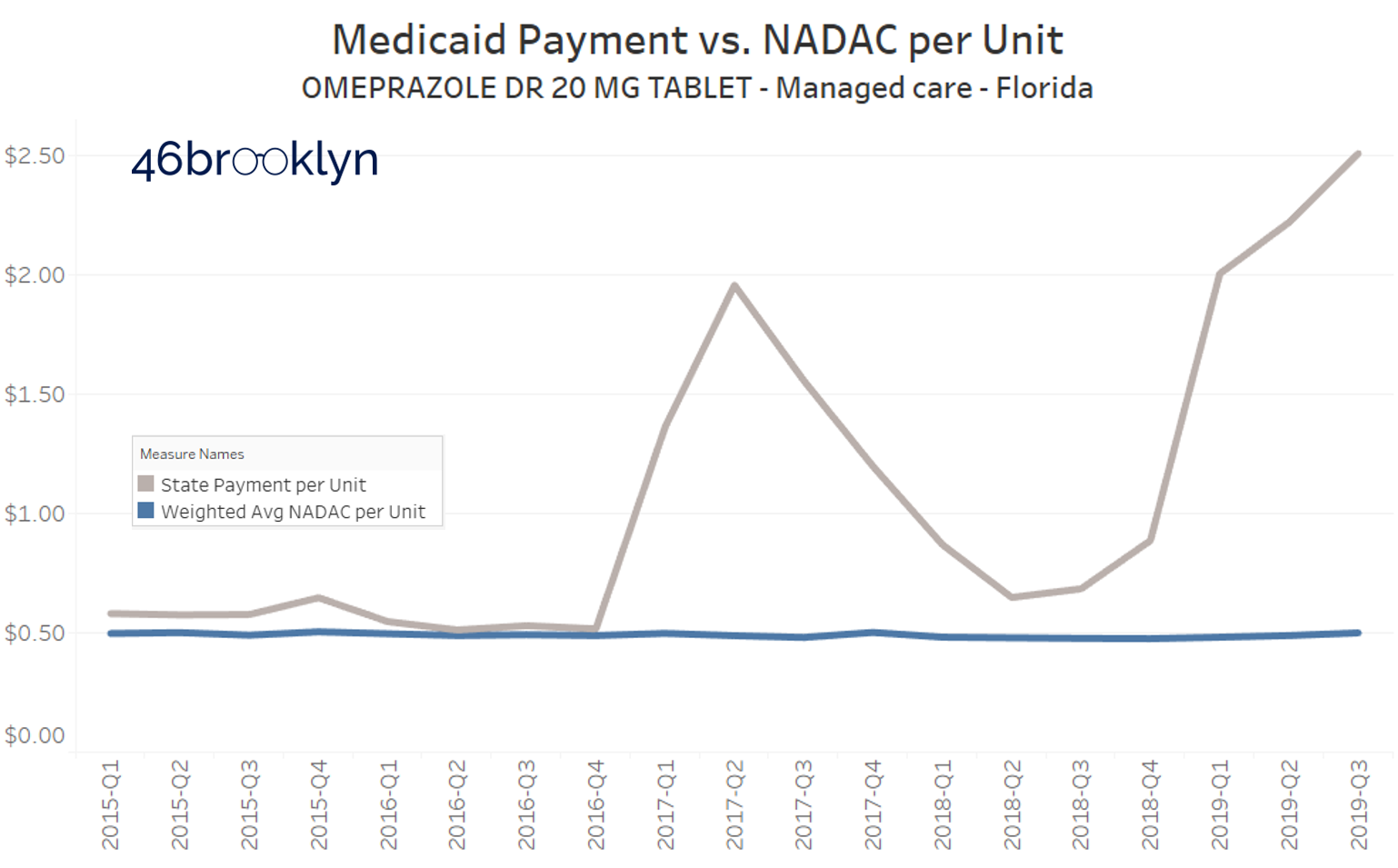
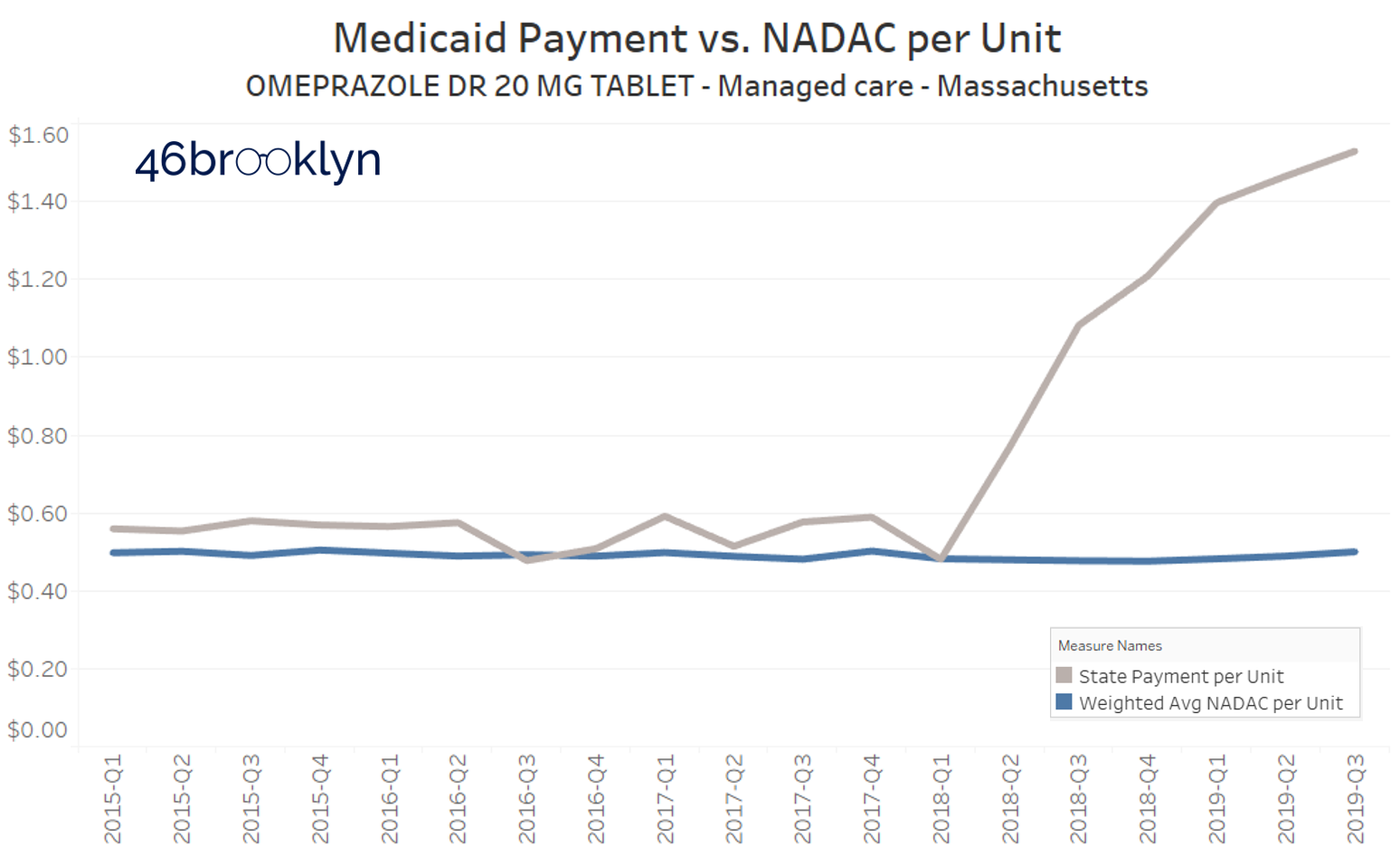
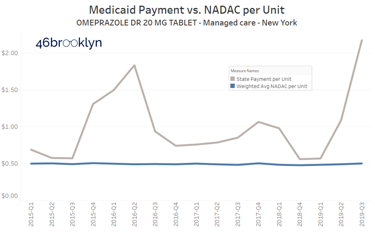
Yikes.
So this visualization served its purpose, helping us and others find some dirty little nuggets of distortion that served as clues as we journey along, trying to understand the depth of the dysfunction in our U.S. prescription drug supply chain.
But there were two big problems with this dashboard:
First, the dashboard is very hard to use. There is way too much information on it. We are pretty sure we violated every best practice for Tableau visualization design, which likely explains why it’s one of our least used dashboards.
Second, it was an absolute pain to update. We simply didn’t design the database in a manner that facilitated easy updates, so it became stale very quickly.
A rebuild of this dashboard had been on the back burner for some time. With the rapid onset of COVID-19, creating the demand for better knowledge on where our drugs are coming from, it became clear that the rebuild had to happen now. But what was even more clear, was that the purpose of the dashboard had changed. It was no longer to study the dysfunction of the supply chain; it was now simply to understand where we have concentration risk. This allowed us to simplify the layout of the dashboard, which will hopefully greatly enhance its usability.
But you be the judge. Here are the before and after shots:
BEFORE:

Figure 2
Source: Data.Medicaid.gov, FDA.gov, 46brooklyn Research
AFTER:
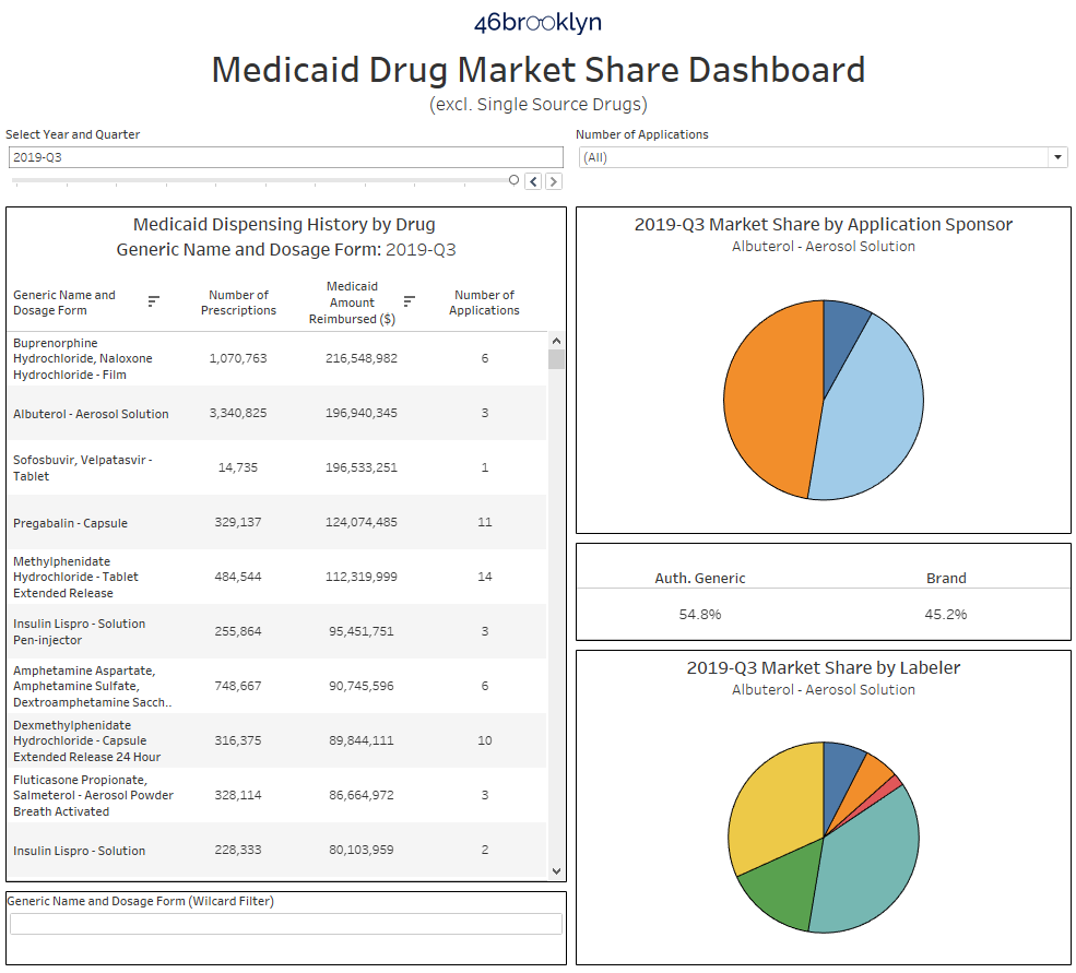
Figure 3
Source: Data.Medicaid.gov, Elsevier Gold Standard Drug Database, Drugs@FDA, 46brooklyn Research
How to Use this Tool
First off, you can find the dashboard in one of two places – on its own 46brooklyn visualization page, or directly on Tableau Public.
There are three primary sections of the dashboard. The table on the left side of the visualization ranks all drugs dispensed in Medicaid within the selected year and quarter at the top. The visualization defaults to the latest quarter of data, Q3 2019, and descending rank by Medicaid Amount Reimbursed. You can change the time period by using the “Select Year and Quarter” filter directly above the table. You can also change how the drugs are sorted by clicking on the header of the column on which you would like to sort the data. As an example, to rank all drugs from high to low by Number of Prescriptions, simply click on “Number of Prescriptions.” You will know it worked properly if you see the little sort icon appear next to your chosen field (Figure 4). The right most column is a distinct count (during the selected year-quarter) of how many FDA applications were behind the dispensing of this drug within Medicaid.
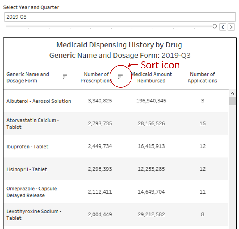
Figure 4
Source: Data.Medicaid.gov, Elsevier Gold Standard Drug Database, Drugs@FDA, 46brooklyn Research
This is quite complicated, so let’s go back to our OTC generic Prilosec (omeprazole) example to explain what we mean.
To find this drug, simply type “omeprazole” into the wildcard filter below the table. If you are sorted on Number of Prescriptions, omeprazole will be the third row down. You will see that only one application is listed (Figure 5). This means if you pulled the FDA application off of which all 78,761 Medicaid prescriptions (in Q3 2019) for this drug were based, it would be just one application.

Figure 5
Source: Data.Medicaid.gov, Elsevier Gold Standard Drug Database, Drugs@FDA, 46brooklyn Research
So to investigate further, simply click on this drug, and as shown above, the charts on the right will update. The top right pie chart shows the market share by FDA applicant name (also called “sponsor”). Hover over any slice of the pie (or in this case, the entire pie) to see which company owns the application. In this case, its “DEXCEL PHARMA,” an Israeli drug manufacturer. Down below, you will see all of the “labelers” that distribute off of Dexcel’s application. While Perrigo is the largest, with 66% market share in Medicaid, there are clearly several labelers in play. But upon hovering over each, you will see that despite all of these different labelers selling the product, it’s the same product, all derived from FDA application number “NDA 022032.”
So does this mean that all of Medicaid’s OTC generic Prilosec is made by one manufacturer? Unfortunately, we can’t draw that conclusion without additional research that is beyond the scope of our tools. But in this case, it’s not beyond the scope of what we can easily do! Simply navigate over to DailyMed, type in “Omeprazole” and start looking at package labels for the tablet versions of this drug. You will quickly notice that no matter how the drug is branded (e.g. Perrigo, Equate, Good Neighbor, Leader, Kirkland, etc.), nearly all packages say “Made in Israel” or “Product of Israel.”
So in this case, there appears to be enough clues to form conviction that most of this country’s OTC omeprazole is originating from one source. But just because the tool worked for omeprazole tablets, it does not mean the application will always directly point you to manufacturer market share. However, it does collect and organize information in a way that hopefully will aid your research.
Let’s move onto drugs with much higher utilization. Again, if you sort by “Number of Prescriptions,” you will immediately find them. Start clicking on each one, and it won’t take long to see interesting market share situations on very common (and ultra-cheap) generic drugs.
Take lisinopril tablets. It’s the #4 multi-source drug by number of prescriptions in Medicaid in Q3 2019. It also has 12 distinct FDA applications – a good sign that there is sufficient competition in the market. But click on the drug, and you will see a different picture. Two applications comprise 98.4% of all lisinopril dispensed in Medicaid – LUPIN (blue) and PRINSTON INC (grey).
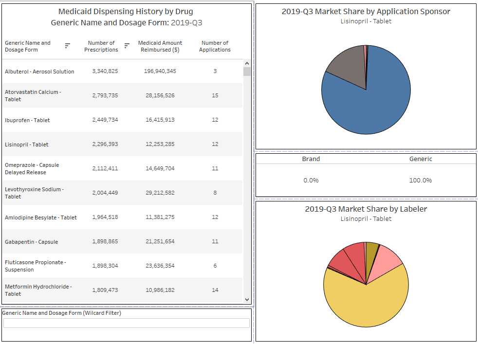
Figure 6
Source: Data.Medicaid.gov, Elsevier Gold Standard Drug Database, Drugs@FDA, 46brooklyn Research
You can then click on LUPIN (the dominant player, with a 81% share of the market) to see which labelers are marketing off of Lupin’s application. The bottom right pie chart shows that there are three: Lupin Pharmaceuticals (light yellow), Legacy (Pink), and BluePoint (mustard yellow).

Figure 7
Source: Data.Medicaid.gov, Elsevier Gold Standard Drug Database, Drugs@FDA, 46brooklyn Research
Interestingly, Medicaid’s lisinopril market share wasn’t always this concentrated. If you flip back to Q1 2017, the first quarter we have available in the tool, we see a very different picture (Figure 8). There used to be a big pink slice attributed to sponsor company CASI Pharmaceuticals, who in early 2018 announced the acquisition of a collection of FDA drug applications (including lisinopril) from Sandoz.

Figure 8
Source: Data.Medicaid.gov, Elsevier Gold Standard Drug Database, Drugs@FDA, 46brooklyn Research
We can clearly see this Sandoz / CASI relationship in our tool – simply click on that pink slice, and the bottom labeler pie chart will show that effectively all of the drugs dispensed in Medicaid off this application, carried the Sandoz brand (Figure 9).
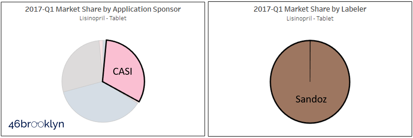
Figure 9
Source: Data.Medicaid.gov, Elsevier Gold Standard Drug Database, Drugs@FDA, 46brooklyn Research
Why CASI / Sandoz market share plummeted after CASI’s acquisition of the application is unknown to us. But what is known is now we have a set up where one applicant has 80%+ of the market.
Is this a problem? Well, it’s clearly not ideal … but that in itself doesn’t necessarily make it a problem. To know if it’s a problem, we would need to know where Lupin is producing this drug, and more importantly, from where/whom it is acquiring the active pharmaceutical ingredient (API). These tools are not designed to answer these questions, only to help researchers focus in on situations where drugs have considerable market concentration.
One last feature we need to explain, and then we’ll move on to the second tool we have created for you.
You may have noticed by now that there is a drop-down filter towards the top right of the dashboard called “Number of Applications.” You can use these to filter the list to drugs that, based on Medicaid’s dispensing data, have 1, 2, 3, 4, 5, or 6 or more applications. The idea here is to be able to directly find drugs that simply do not have many competing FDA applications in place. One very important caveat here though – while our dashboard excludes single-source brand drugs, it does include brands that have an authorized generic. Take sofosbuvir, velpatasvir tablets, which is by far and away the #1 drug by spending in Medicaid in Q3 2019 with only one applicant holder. However, this drug is more commonly known as Epclusa, a drug used to treat Hepatitis C infections manufactured by Gilead. When you click into this drug, you will see there are really no generics available yet – just one authorized generic which started to really take over Medicaid market share in 2019 (Figure 10).
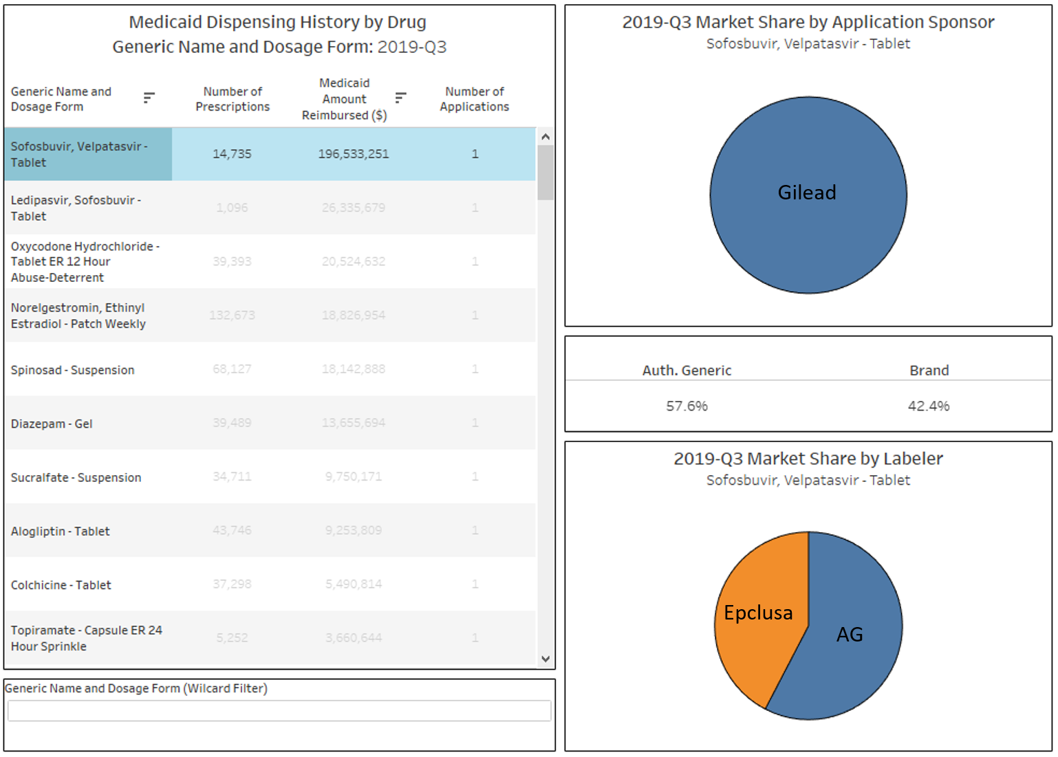
Figure 10
Source: Data.Medicaid.gov, Elsevier Gold Standard Drug Database, Drugs@FDA, 46brooklyn Research
While this tool is interesting to use to find brand manufacturers that are pursuing an authorized generic strategy, one should not interpret this as concentration risk the way we saw such risk with lisinopril or omeprazole. Due to their patent protection and market exclusivity provisions, all brand drugs will by definition be fully concentrated in one applicant until exclusivity and patent protections end and generic competition comes to market.
Abnormal Drug Price Increase Tracker
The second dashboard we’ve created is called the Abnormal Drug Price Increase Tracker (a.k.a. “ADPIT” … we’ll see if that catches on).
The idea for this visualization was borne out of our interest in studying drug pricing volatility, a concept we introduced in our September 2018 generic drug pricing updates. The idea is that to really gauge a drug’s price movement, you need to compare it to the historical volatility of that drug. Stated differently, should we be interested in a 30% increase in a generic drug’s price? Well, if we told you that this drug commonly hops up and down by 50% each month, well then no … this would be normal (although clearly not healthy). But if this drug has never in its past moved more than 5% at a time, then 30% will really catch our attention.
Comparing a price change to a measure of the drug’s underlying volatility is the core purpose of our ADPIT tool.
So how do we do this?
Stated as simply as we can, we loaded the entire CMS NADAC database, which includes NADAC prices for a collection of 24,000+ National Drug Codes (NDCs) into our databases (we use SQL). We then wrote a query to calculate the trailing 52-week 90th percentile price for each drug in CMS’ database. In layperson terms, we took the last 52 weekly prices for one NDC, stacked them on top of each other, and then found the 90th percentile price of the group. Then we told SQL to repeat that 8,178,390 times (24,783 NDCs in the latest week x 330 weeks in database). About an hour and half, and one tired computer later, we have our database. Easy peasy. 🤓
And that’s most of the work in building the tool. The main step after that was to simply divide the current price by the T-52 week 90th percentile. We created logic that if the current NADAC was more than 5% greater than the T-52 week 90th percentile, then we display it on the list. If it’s below that ratio (which we call the “relative impact ratio”), then you won’t find it on the list.

Figure 11
Source: Data.Medicaid.gov, 46brooklyn Research
One of the coolest things about this dashboard is that it is 100% based on public data. This isn’t the case with our Medicaid Drug Market Share Dashboard, which partly relies on paid data from Elsevier Gold Standard Drug Database. But since we are only tracking prices in ADPIT, we were able to limit the database to only CMS’ data, which means we can share it freely for those that want to use it. As usual, you can download the database by clicking on the download icon at the bottom right of the Tableau dashboard.
How to use
Again, you can find the dashboard in one of two places – on its own 46brooklyn visualization page, or directly on Tableau Public.
Scroll back up to Figure 11, and you will see the dashboard. The table at the top is a list of all drugs that are priced in the selected week at least 5% above their trailing 52-week 90th percentile price (Note: you can select and view any historical week back to the start to 2017). Click on any of the generic drugs in the list, and the trend chart at the bottom left will update. Note that this is the same chart you will find on our NADAC Drug Pricing Dashboard, except with the trailing 52-week 90th percentile price (orange line) and the trailing 52-week moving average (red line). Think of it as technical trading chart of sorts, except for generic drug acquisition costs!
Moving back to the table, there are four columns. NADAC (i.e. the drug’s pharmacy invoice acquisition cost), Number of Prescriptions dispensed in Medicaid between Q3 2018 and Q2 2019 (the most current complete 12 months worth of data), Relative Impact Ratio, and Relative Impact Score.
The last two are terms we made up, so let’s explain them in a bit more detail:
As already mentioned, Relative Impact Ratio (RIR) is the NADAC price in the selected week divided by the trailing 52-week 90th percentile. The higher the RIR, the more disconnected the drug’s price from its own historical volatility.
Let’s look at two examples to see what different RIRs look like. The figure below shows two drugs, Naproxen DR 500 mg tablet and Hydrocodone-Acetaminophen 10-325 tablet. In this week’s data, Naproxen sported one of the highest RIRs of all drugs – this is because it jumped to $2.07 per unit, after remaining pretty stable at ~$0.25 for the last year. Hydrocodone-Acetaminophen on the other hand, had one of the lowest RIRs of all drugs that met the criteria to be displayed this week, barely crossing above its trailing 52-week 90th percentile.

Figure 12
Source: Data.Medicaid.gov, 46brooklyn Research
Clearly the move in naproxen is worth some attention. But how concerned should we be? Well, that’s where the Relative Impact Score (RIS) comes into play. RIS weights the RIR based on how heavily the drug is dispensed in Medicaid programs. For those wanting the exact equation, RIS = Medicaid Prescriptions x (RIR - 1). The dashboard is by default rank-ordered by descending RIS, as we see this as the most interesting metric, but as is the case with the market share dashboard, you can rank the data on any of the four columns simply by clicking on the column header.
There is one more chart to cover in this dashboard, and that’s the cumulative RIS chart on the bottom right. All we have done here is add up the RIS for each week and display on a chart. We are trying to provide a sense of how significant (on a weighted basis) the total abnormal price increases were relative to prior weeks. Note that figure shows the trailing 4-week average to account for the fact that NADAC updates are most meaningful to view on a monthly basis.
Please note that the units on RIS are irrelevant. They are not dollars, prescriptions, or units. They simply serve the purpose to compare to prior weeks. So please do not read into them any further than that.
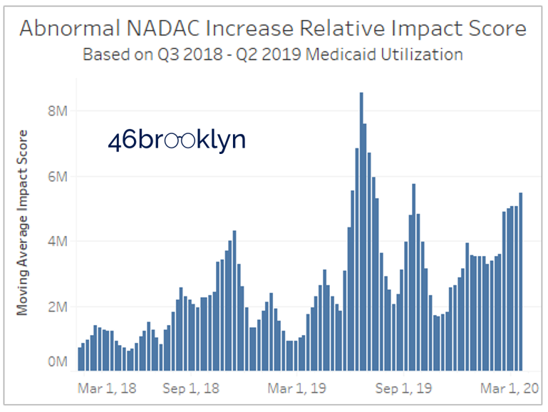
Figure 13
Source: Data.Medicaid.gov, 46brooklyn Research
So what we can conclude from the chart is that we currently are at a high cumulative RIS, but we have exceeded this level twice in the past year (June and September 2019).
To understand what caused the RIS to spike in those months, simply choose a new date from the “Choose Date of Update” filter, and rank-order the list by RIS. You’ll see that back in mid-June, there was a pretty significant cost increase on Ranitidine 15 mg/ml syrup, Vitamin D2 1.25 mg, and Hydrochlorothiazide 25 mg tabs – all which had meaningful Medicaid volume. In addition, there was a massive spike in fluoxetine 20 mg/5 ml solution, driving its RIS up to #4 on the list despite having less than 100,000 annual claims in Medicaid.

Figure 14
Source: Data.Medicaid.gov, 46brooklyn Research
Of course, the natural question on your minds is if this tool is showing us any COVID-19 related shortages. If you are asking that right now, return to Warning #1 at the start of this report – no information in either of these tools can specifically tell us if a drug is in shortage. But price spikes are clearly helpful in understanding what could be a result of – or headed towards – a shortage.

Figure 15
Source: Data.Medicaid.gov, 46brooklyn Research
Let’s take some shortages that we already know about, and see how the tool captured them. Valsartan was initially reported by the FDA as in shortage starting in August 2018. As shown in Figure 14, NADAC first crossed its trailing 52-week average in October 2018, spiking well above this level. Given that NADAC has a roughly one month lag (survey results reported in October 2018 reflect pharmacy invoice pricing from September 2019), this timing makes sense. As of the start of this month, the FDA marked the shortage as resolved. Meanwhile NADAC has plateaued, potentially a supportive sign that the shortage truly has been resolved (Figure 15).

Figure 16
Source: Data.Medicaid.gov, 46brooklyn Research
Fast forward to the start of this year, and the next big common retail-dispensed generic to get reported on shortage was Ranitidine (reported on January 7, 2020). In this case, NADAC first spiked in mid-January, suggesting that pharmacies were already seeing the impact of the shortage in December 2019 (Figure 16).
But just because the tools captured these two reported shortages does not mean it will capture them all. First off, any drug normally dispensed in a hospital setting or specialty pharmacy will not be in NADAC, which means they won’t be in this tool. Second, drugs that are very rarely dispensed in a retail setting may be so infrequently reported by pharmacies, that the NADAC won’t change during a shortage. For more on how this tool compares to the FDA shortage list, see our Q&A page for this visualization.
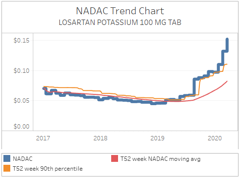
Figure 17
Source: Data.Medicaid.gov, 46brooklyn Research
One of the benefits of this tool though is that, unlike the official drug shortage repositories, it is indifferent to what manufacturers report. It only dispassionately cares about price. So what that means is that you will see drugs like losartan on this list (Figure 17), which clearly are exhibiting concerning pricing movements despite not being listed on any official shortage report. So, we believe that this is a helpful tool for researchers to use in conjunction with the official shortage databases.
While we believe NADAC to be the most responsive benchmark to supply/demand driven changes, it still only shows us prices a month in arrears. Unfortunately, this means it has no way of picking up rapidly-developing shortages (driven potentially by rumor or speculation), like the one that just started this week on hydroxychlorquine, driven (we think) by speculation that chloroquine sulfate could be a potential COVID-19 treatment.
We can capture these changes better than once a month though. Myers and Stauffer, the company that administers the NADAC survey, will take calls from pharmacists looking to report gaps between their current invoice costs and NADAC. They then update these prices weekly. Pharmacists, please call the Myers and Stauffer help desk to report pricing changes as you see them! If you report them, we will all be able to see pricing movements as they happen, rather than having to wait until it could be too late.
Use the Tools. Heed the Warnings
We’ll close with one more reminder to please heed the warnings presented at the beginning of this report. In short, these tools are meant to help identify market movements and embedded risks that COULD result in or signal a potential shortage. Please use them responsibly.