

NADAC Drug Pricing Dashboard
Last Updated As Stated in Dashboard
The concept for this viz (a.k.a. visualization) came from simply wanting historical trend charts to assess the change in drug costs over time. Helpful... but we needed to take this a step further to be able to easily compare the price of brand name drugs with their generic equivalents. That data lives in the FDA's databases, so we married that up with NADAC in Tableau and voilà - an interactive drug price trending tool. Hover over the line and you can see all of the manufacturers and National Drug Codes (NDCs) each week as well.

US Medicaid Drug pricing MAP
Last Updated As Stated in Dashboard
For all of the data viz purists out there, here’s another crack at the Medicaid Drug Pricing Heat Map that eliminates the pesky “Alaska Effect” (i.e. the annoyance that AK and HI distort the scale of a geographic map). We also simplified and streamlined the number of buttons and options on the Hex-Map to hopefully improve the efficiency of your Medicaid pricing distortion hunting activities.
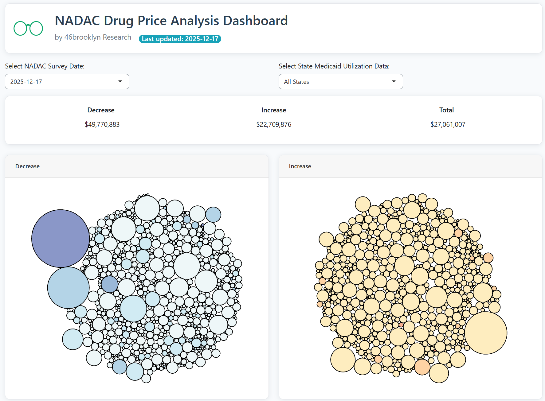
NADAC Change Packed Bubble Chart
Last Updated As Stated in Dashboard
Once a month (normally the 3rd or 4th week) CMS publishes the results of their monthly retail pharmacy survey. The results of this survey reflect thousands of drug price changes. We wanted to be able to put some context around all of these changes, so we joined the survey results with Medicaid's latest dispensing data to better understand the aggregate impact of all of the latest generic pricing changes using a real life drug mix

Medicaid Markup Universe
Last updated on 08/02/2024
In traditional PBM “spread” contracts with payers, the payer pays one price for a generic claim, and the provider is paid some other amount for that claim. While calculating the precise spread in Medicaid is not possible given that PBM payments to pharmacies are not public, we can get a feel for how disconnected the price paid is from the ingredient cost by comparing CMS state utilization data to CMS NADAC data. From this comparison, we have derived “markup” and have created a celestial-feeling visualization for you to see where all of it is and is not.

Photo by Miriam Espacio from Pexels
Medicaid Markup Galaxies
Last updated on 08/02/2024
Looking to drill deeper into a state’s markup universe? Then this viz is for you. Medicaid Markup Galaxies separates each universe into three different groups (or celestially-speaking, “galaxies”). We call them the High-Cost, In-Range, and Low-Cost galaxies. The goal in doing so is to better quantify the nature of generic pricing distortions within state Medicaid programs.

Photo by Hugo Aitken on Unsplash
Medicaid Drug Market Share Dashboard
Last updated on 02/14/2024
If we want to understand drug pricing, we need to understand supply and demand. And any study of supply and demand inevitably is going to lead to the hunt for market share data. Market share is an easy and convenient place to start to try to make sense of all of the generic drug pricing nonsense. Market share analysis shows lots of competitors, each with with a relatively small slice of the pie? That’s a signal of healthy competition among generic manufacturers, which should result in lower prices. Market share concentrated with one manufacturer? That’s not great for competition, and could explain pricing oddities for the drug. Our Medicaid Drug Market Share Dashboard is designed to help you answer these questions.

Brand Drug List Price Change Box Score
Last updated on 2/10/2026 [Data thru 2/6/2026]
Much like a box score in baseball tallies up each player’s stats for a game, our Brand Drug List Price Change Box Score tallies up all price changes by manufacturer and drug – for any period you want to see. The tool provides you with a decade of historical context, and for the first time (that we know of) weights price changes to better account for differences in utilization from one drug to another. Be careful though – the most significant limitation to this data is that it does not include manufacturer rebates. But the discussion on list price increases rages nonetheless – now at least you have better facts to contribute!

Medicare Part D Drug Pricing Ski Slope
Last Updated on 7/13/2019
Longing for winter, ski bums? Well, we have a big dump for you! In this viz, you can select a drug and view the price set for the drug by thousands of Part D plans. For good measure, we added a line to show you the true market-based cost of the drug, so you can see how frustratingly random pricing is across plans for generic drugs.

Medicare DIfferential Drug Pricing Experience Tracker
Last Updated on 12/3/2024
Ever wonder why some people think their medications are affordable whereas others think they’re not, even if they are taking the same medication? Us too. And while we may not know why, we can investigate pricing experiences in one of the largest U.S. drug insurance markets: Medicare. As a program designed to care for the elderly, this tool offers an opportunity to visualize these drug pricing variances, identify patterns, and achieve greater transparency in prescription drug pricing for a program providing drug coverage to over 50 million Americans.

46brooklyn Drug Launch price contextualizer
Last Updated on 3/9/2023
You’ve seen the annual brand drug list price changes in our Brand Drug List Price Change Box Score, which can provide great insights on week-by-week drugmaker activity. But with heightened scrutiny and pressure on year-over-year list price increases, the launch prices of new drugs have become an increasingly important research space. But as is typical, much of vitriol over rising launch list prices is missing critical context and nuance, which we have set out to provide as best as possible. See for yourself in the new 46brooklyn Drug Launch Price Contextualizer.

Medicare Part D Drug Pricing Dashboard
Last updated on 07/20/2025
Explore total spending and per claim costs on thousands of drugs across Medicare Part D in 46brooklyn’s Medicare Part D Drug Pricing Dashboard. This dashboard takes Part D spending data published by CMS and adds helpful identifiers to gain better insight into Part D spending trends on brand, generic, and specialty drugs.

ABNORMAL DRUG PRICE INCREASE TRACKER (ADPIT)
Last updated on 07/24/2024
Generic drug prices are designed to go down. This, we all know. But many generic drug prices go up as well. Most times this is nothing to fret about, it’s just part of the random walk that is the price trend of all generic drugs. But other times, prices can increase quickly. It’s helpful to research these drugs to figure out what’s going on. But first we have to find them. If that’s what you’re looking to do, it’s time to call in some help from ADPIT!

Drug Pricing Down Under Dashboard
Last updated on 9/1/2020
Curious what other countries pay for the drugs you take? How about we start with Australia! The Drug Pricing Down Under Dashboard lets you compare U.S. and Australian prices on a whopping 1,258 different drugs. Spoiler alert! After you get past the disbelief in the discounts that somehow Australia is negotiating (it took us a while) grab a coldie and head on over to Expedia to book your next flight to Australia. The Canadian medical tourism industry is about to get a run for its money!
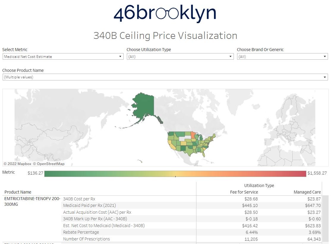
340B Drug Pricing Dashboard
Last updated on 5/23/2022
What does a drug cost? The answer to that question is tougher than you think. But one of the pricing benchmarks that gets a lot of attention is the 340B ceiling price, as it can help us understand what ‘best price’ for products, especially high cost brand name medications, looks like. That’s why when we found a public source for 340B prices buried within the Texas Medicaid Drug Vendor files, we just had to make a visualization to explore those prices. Explore the data at a granular level, and take your first step into a larger world.

The Super special Drug pricing dashboard
Last updated on 5/10/2023
We do not buy drugs at cost, we buy drugs at discounts. Sometimes those discounts are large, like for generic drugs, and other times they’re small, like for specialty drugs. However, our eyes often deceive us when it comes to understanding the value of our discounts due to loose contractual language around the things we’re buying - namely “brand,” “generic,” and “specialty” medications. This visualization allows us to explore our perceptions of drug pricing discounts to see how PBMs help us choose our own artificial reality when it comes to the drug prices we pay.