
Drill deeper into markup within Medicaid programs
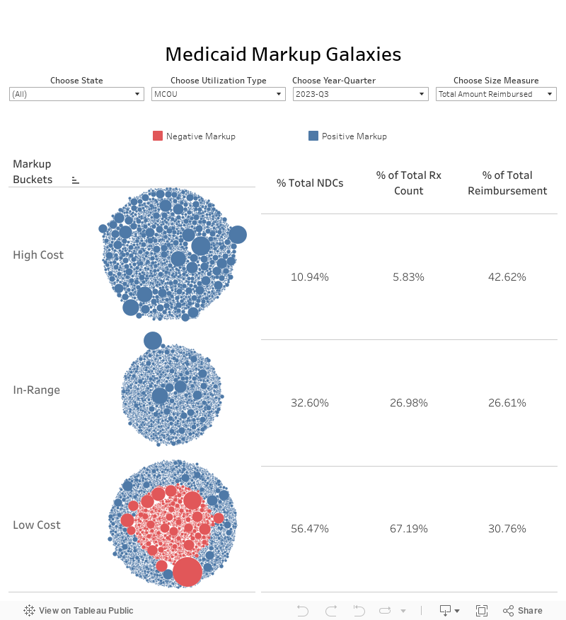
Our Medicaid Markup Universe visualization helps illustrate the large variation in markup (state cost less pharmacy acquisition cost) state Medicaid programs are paying for different generic drugs in any given quarter. While it provides a good qualitative feel for individual drug pricing distortions, it doesn’t help quantify the distortions. So we’ve created the Medicaid Markup Galaxies dashboard to do exact this. It drills down to three different groups (or celestially-speaking, “galaxies”) within each state’s universe of drugs. We call them the High-Cost, In-Range, and Low-Cost galaxies.
We consider an In-Range markup to be anywhere between $5 and $15 per prescription (see our “Medicaid Markup Galaxies” report for a more comprehensive discussion on this). It follows then that any drug with a markup above $15 is High-Cost, and any drug with a mark-up below $5 is Low-Cost. It’s really a relatively minor enhancement to the original universe, but unlocks a whole new galaxy (pun intended) of learning opportunities on markup!
Data Sources
How we Created our Dataset
46brooklyn's visualization tool of choice = Tableau Prep
Lag effect generic drug NADAC prices (NADAC is reported on roughly a one-month lag)
Aggregate weekly NADAC into quarterly NADAC
Join State Utilization Database and lagged quarterly NADAC on NDC and Year-Quarter
How to Use
Each bubble is a different NDC - hover over any bubble to bring up relevant information on the drug
Bubbles are grouped by markup galaxy: High-Cost, In-Range, and Low-Cost (top to bottom)
The right side of the viz shows the percent of NDCs, prescriptions, and cost that fell into each galaxy
Change how bubbles are sized using the filter in the top left corner of the visualization. Bubbles can be sized by Markup per Prescription, Number of Prescriptions, or Total Amount Reimbursed
Use the other three filters to choose state, utilization type (fee-for-service or managed care) and period
There are two bubble colors - most are blue, which indicates a positive markup. Some are dark orange, which indicates a negative markup (i.e. state reported cost was lower than pharmacy acquisition cost)
v 2.0 - posted August 2, 2024
For full release notes click here