
The Rise of the Drug Mix Empire
In a dark place we find ourselves, and a little more knowledge lights our way.
Welcome my young apprentice. For as long as we’ve been following drug pricing, our country has been fixated on manufacturer price increases. We want to know how many occurred, and how big they were. We want to know who did them, and why.
If we’ve learned anything from our revamped Brand Drug List Price Change Box Score, it’s that all of this attention and scrutiny on drug prices has had the desired effect – drug price increases are undoubtedly in decline, both in count (Figure 1) and magnitude (Figure 2).

Figure 1
Source: 46brooklyn Research, derived from Elsevier Gold Standard Drug Database (GSDD)

Figure 2
Source: 46brooklyn Research, derived from Elsevier Gold Standard Drug Database (GSDD)
Let’s say you realize, as we did, that trying to size price increases using an unweighted measure (like median) is about as useful as trying to control executive powers using Jar Jar Binks. So, you correct this by weighting the price changes using data more representative of typical utilization trends – CMS State Drug Utilization Data (SDUD), which represents the drug mix from state Medicaid programs across the country. This way, a 7.4% price increase on the $2.2 billion of annual pre-rebate Medicaid spending on Humira will mean a whole lot more than the 95% decrease on the $201 of pre-rebate annual spending on Vistaril.
Not only will this not change your conclusion that the size of price increases is in decline, it will further enhance this conclusion, as the decline in the weighted brand drug price increase is greater than the decline in the median brand drug price increase (Figure 3).

Figure 3
Source: 46brooklyn Research, derived from Elsevier Gold Standard Drug Database (GSDD) and data.medicaid.gov
If you were wondering why we use Medicaid data, it’s because Medicaid is the only program that provides granular enough utilization data – available on data.medicaid.gov to all – to weight price increases. This is the same dataset we’ve used to help highlight Medicaid prescription drug mark-ups, spread pricing, and other related pricing distortions. However, there is no reason why CMS couldn’t make this type of data available for Medicare Part D and other Federal programs. If CMS and other federal officials truly want to be champions of transparency, they should make NDC-level data readily accessible to the public within their data hub so we all can have a more complete picture on our nation’s prescription drug consumption and spending trends.
As a quick aside – if you are scratching your head on why the weighted average is so much higher than the median between 2011 and 2016, it’s not just weighting; it’s largely driven by the fact that it was common practice over the first half of the past decade to institute multiple price increases in one year on the same drug. In fact, as shown in Figure 4, this costly little practice peaked in 2013, when there were 759 drugs with two or more price increases, compared to 633 with a single price increase. With this as context, it’s no wonder that the weighted average price increase reached its height in this same year (14.4%).
Figure 4
Source: 46brooklyn Research, derived from Elsevier Gold Standard Drug Database (GSDD)
Back to Figure 3, one thing that may trouble you with both the median and weighted average is that they are both calculated only based on the population of drugs that experienced a price change. This, of course, can be misleading.
To illustrate, consider after a long day tending to your moisture farm you walk into Mos Eisley Cantina. Unfortunately, the Sith-Imperial War has strained the beverage supply chain, limiting the options to parch your thirst to just two – Jawa Juice and Green Milk. You of course choose to order a Jawa Juice and strike up a conversation with your bartender, Wuher, and quickly learn that that the Jawa Juice is in particularly short supply, forcing Wuher to increase its price by 10% tomorrow. His supply of Green Milk looks more stable though, so he’s not going to increase his Green Milk price. He also tells you that he sells equal amounts of both at the same credits per drink.

Knowing this, what’s the weighted average increase of these libations tomorrow? 5% of course. 10% on Jawa Juice and 0% on Green Milk. Pretty obvious, right? Yet, when we are measuring increases in drug prices, we typically only size the increases over the population of drugs that increased. If Wuher did that, the increase of items in his cantina would be 10%, or a clear Jedi mind trick.
But as you know, Jedi mind tricks are only supposed to work on the weak-minded. And unfortunately, most conventional discussions and debates around drug pricing are highly reliant on using this (wrong) shortcut to size drug price increases, because the task of sizing price increases correctly is extremely difficult to perform (requires joining multiple databases and throwing some complex level of detail calculations on top of them). Fortunately, this level of Force wielding won’t have to be a necessary part of your training. We’ve consulted the ancient Jedi texts (using CMS SDUD and Elsevier’s Gold Standard Drug Database), performed all the hard work for you, and made it available for you in the Brand Drug List Price Change Box Score.
While this more correct method of calculating the weighted average price increase certainly gives us a more accurate number, it still doesn’t change our thesis that the size of price increases is going down over time (Figure 5).
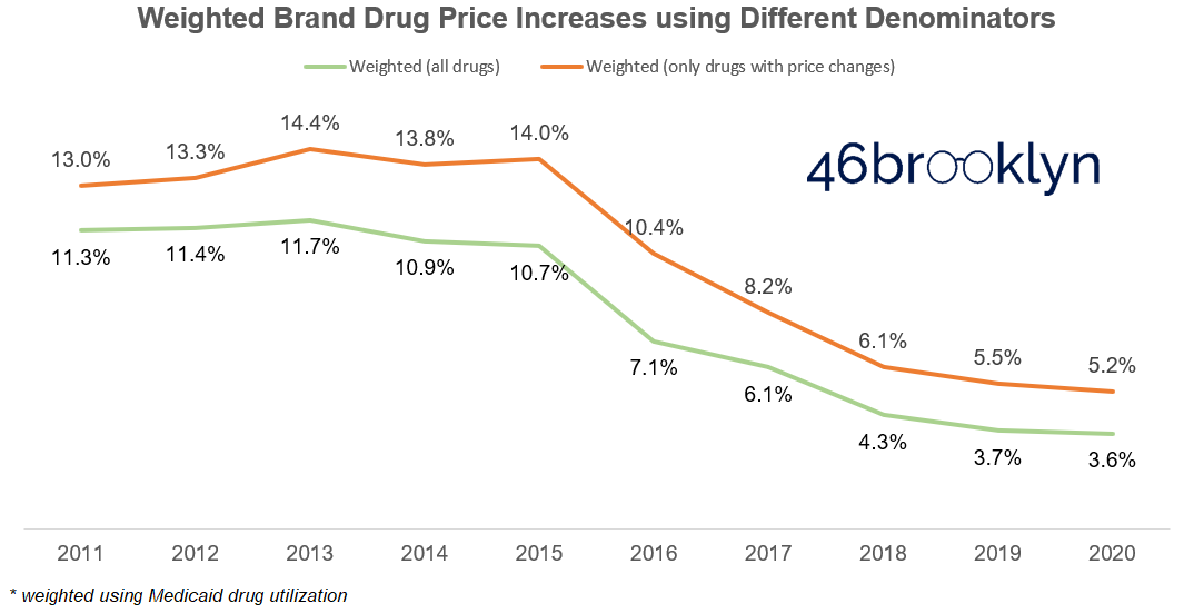
Figure 5
Source: 46brooklyn Research, derived from Elsevier Gold Standard Drug Database (GSDD) and data.medicaid.gov
So any way you look at it, brand drug price increases are down considerably in both number and size. This is a monumental turnaround … from a certain point of view.
Yet as we stand here amidst this achievement, Medicaid gross spending on brand name drugs is run-rating to surpass $52 billion in 2020, the highest mark of all time. This is nearly double the $28 billion (gross) spent in 2011 (Figure 6).

Figure 6
Source: 46brooklyn Research, derived from Elsevier Gold Standard Drug Database (GSDD) and data.medicaid.gov
What gives here? How can gross spending be escalating as price increases are falling? This isn’t a Zen Buddhist Koan or one of Yoda’s unsolvable Jedi riddles. There is an answer to this puzzle that starts with analysis of pre-rebate cost per claim in the Medicaid program.
You must unlearn what you have learned
While the Brand Drug List Price Change Dashboard doesn’t present all of the information required to solve this puzzle, it does put us on the right path to the answer. If you scroll down to Stat Box #6 in the dashboard, you’ll see the pre-rebate cost per claim in Medicaid on drugs with price changes (Figure 7).

Figure 7
Source: 46brooklyn Research, derived from Elsevier Gold Standard Drug Database (GSDD) and data.medicaid.gov
Please note that the cost per claim presented actually corresponds to the prior year. We had to do this because we want you to see this metric for drugs with 2021 price increases, but clearly won’t have 2021 Medicaid utilization for some time. Also, Stat Box #6 only considers drugs with price changes. This means that drugs like insulins, which haven’t had price increases in a few years, will be left out of the series in recent years. But still, this tells us there has been a 260% increase in the weighted average pre-rebate cost of this group of brand name drugs in the past decade, a number that should get our attention.
At this stage, we have to let go of the dashboard and dive directly into Medicaid’s data to see what this looks like for all brand name drugs in Medicaid. We simply applied our same brand definition directly to Medicaid’s raw State Drug Utilization Data and then divided Medicaid spending by the number of prescriptions for the overall program (for those familiar with SDUD, that’s when State = “XX”). The output is shown in Figure 8. Looking at all brand name drugs, there has been a 197% increase in the pre-rebate brand drug cost per claim – not as steep as the increase on drugs only experiencing price increases, but still enough for us to take pause. If you convert this to compounded average growth rate (CAGR), the weighted average list price of brand name drugs has increased at an 11.5% annualized rate over the last 10 years.

Figure 8
Source: 46brooklyn Research, derived from Elsevier Gold Standard Drug Database (GSDD) and data.medicaid.gov
But let’s return back to the green line in Figure 5, which as a reminder, is a proxy for the weighted average price increase on brand drugs relative to all Medicaid spending on brand drugs – the most accurate way, in our view, to measure the impact of price increases. Note that this number hovered around the 11-12% range for the first part of the decade, but has rapidly declined since then. In fact, the precise CAGR of price increases alone over the same time period is just 7.5%, leaving a four-point gap that is unexplained by price increases. To make matters worse, this gap is expanding over time as brand drug price increases diminish but the cost per claim continues its double-digit percentage upward march (Figure 9). Long story short, drug price increases are, over time, becoming a smaller driver of higher drug prices.

Figure 9
Source: 46brooklyn Research, derived from Elsevier Gold Standard Drug Database (GSDD) and data.medicaid.gov
Mix and Tatooine Purple Juice
So how do we explain this gap?
Simply put, it’s “drug mix.” Mix is more than just a vehicle for us to jam another Star Wars analogy into this report. Mix is a very real concept that the gap in Figure 9 is suggesting we need to understand to rein in prescription drug list price inflation. So to help us learn about mix, let’s return to the wretched hive of scum and villainy that is Mos Eisley Cantina…
A busy month passes, where you just couldn’t break away from your moisture farm (not even to head over to Tosche Station to pick up some power converters!). Finally you get a brief respite from your work and head into the cantina to see your friend Wuher. As soon as you sit down, Wuher excitedly tells you he just received a shipment of Tatooine Purple Juice. He then breaks the bad news that he’s all out of Jawa Juice, and doesn’t expect it to be back at the cantina anytime soon. You resign to try Wuher’s new offering, as the Green Milk just doesn’t agree with you. The bill comes a few minutes later, and you are shocked to learn that your Tatooine Purple Juice was going to set you back four credits! That’s a steep price compared to the Jawa Juice and Green Milk, which just a month ago, both cost two credits. But with so few options, what other choice do you have? Upon further discussion with Wuher, you realize you are not alone in this sentiment – he expects to sell equal quantities of both the more costly Tatooine Purple Juice and the cheaper Green Milk.
Curious about the impact of mix on Wuher’s business, you grab a napkin off the bar and do the “back of the napkin” math. A month ago, Wuher sold equal amounts of two drinks that each cost two credits. Now he plans to sell equal amounts of one drink that costs four credits and another that costs two credits. So his weighted average cost per drink is three credits, a 50% increase versus last month. But what was the weighted average percent increase on each individual drink? It was zero. There was no price increase on the Green Milk or on the Tatooine Purple Juice. So the entirety of the price increase at the Cantina was driven by mix.
Upward “mix” pressure on brand drug costs is, in general, a natural phenomenon
Brand drugs very much work like drinks in the Mos Eisley Cantina, if Mos Eisley Cantina had thousands of drink options all with different prices and volumes. Individual brand drugs are constantly cycling in and out of the amorphous group we broadly call brand drugs. And this cycling is completely by design. New drugs come to market, with the lucky few gaining tremendous volume. Years pass and these blockbuster brand drugs go generic, shifting their volume out of the brand drug pool and over to the generic pool. These brand drugs are then replenished with new, more expensive, hopefully innovative, brand drugs. And the cycle goes on and on.
Consider another lens through which we can study mix. For argument sake, let’s arbitrarily draw a line in the sand separating the “expensive” brand claims from the “inexpensive” ones at $2,000 per claim. Then let’s figure out what percentage of pre-rebate Medicaid spending each year is on the expensive claims. Figure 10 presents the results of this analysis. A decade ago, high-priced claims made up just 16% of overall Medicaid spend. Today, they are responsible for more than half of all spend. This analysis hints at a significant mix shift from “inexpensive” to “expensive” brands in Medicaid.
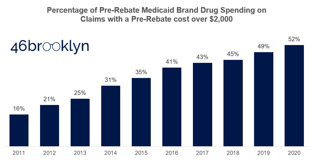
Figure 10
Source: 46brooklyn Research, derived from Elsevier Gold Standard Drug Database (GSDD) and data.medicaid.gov
So why the natural upward pressure? Conceptually, here’s one answer. Decades ago, there were all sorts of disease states plaguing wide swaths of America that could use better treatments (i.e. high cholesterol, high blood pressure, diabetes). With the opportunity to stuff their medications into such a high number of Americans, drugmakers could set prices at a lower level (at least relative to today). As more and more of the low-hanging Jogan fruit (another Star Wars reference for those of you keeping count) disease state treatments were harvested, disease states got more complicated to treat, addressable population sizes got smaller, and launch prices increased. So over time, we end up cycling out cheaper brands designed to treat large populations, and replacing them with expensive brands designed to treat smaller populations. At least this is the argument we believe brand drug manufacturers would offer.
Before we provide the counter-argument, we shouldn’t dismiss the credibility in this argument. We can’t simply look at weighted average inflation in overall brand drug list prices and say this is categorically the Dark Side of the Force. Take Ventolin for example. If you are wondering why Medicaid’s cost per claim stepped up so much from 2018 to 2019 (Figure 8), it’s primarily driven by the decline in usage of the $55 per claim, and therefore crazy cheap – at least for brand drug standards – Ventolin. In 2018, there were around 10 million Ventolin prescriptions sold into Medicaid. After generic options came to market in 2019, 70% of that brand Ventolin volume disappeared. So, wipe out seven million very cheap claims from Medicaid’s brand drug mix, and what happens to its weighted average cost per claim? That’s right, it corrects upward. This is not a bad thing. In this case, the data is just highlighting how good of a job the Medicaid program did flipping Ventolin to its even less expensive generic alternative.
So what are drug manufacturers to do when they lose the Ventolins of the world to the Sarlacc Pit of generic competition, without any more addressable markets that can generate Ventolin’s blockbuster sales volume? In the extreme case, develop gene therapies like Zolgensma, which in 2019 came to market with a price tag of more than $2 million per treatment – five orders of magnitude more than Ventolin (or akin to comparing a space station to a moon). And look, we aren’t here to tell you that Zolgensma’s price tag is fair or not. Because that requires judging how much a human life is worth. We simply provide this illustration as an example of the natural secular shift from high-volume maintenance brand drugs to low-volume (i.e. orphan) specialty drugs. We also provide it as an example to illustrate how important it is to get a drug’s launch price “right,” as with price increases losing their impact, launch prices will be the primary driver of U.S. drug list price inflation.
But mix is also being gamed in the U.S.
While all of the above is conceptually and practically true, it breaks down when it comes to line extensions. To be clear when we say “line extensions,” we’re not referring to Medicaid’s currently limited (but potentially broadening?) definition of the term. Rather, we use the term to refer to any drug that is a tweak or modification of a pre-existing drug (that, not coincidentally, is probably about to go generic).
As we’ve written about previously, the U.S. is unique amongst developed countries in that there is no regulatory body that is tasked with judging the relative cost effectiveness of a drug. Here, the FDA simply approves drugs based on safety and efficacy, and then releases it to the market to adopt or not. But we don’t have an unconflicted, market-based mechanism to regulate the adoption of poor cost/benefit drugs. Rather, we have Pharmacy Benefit Managers (PBMs), those thoroughly conflicted middlemen that actually make more money by preferring high list price, high rebate drugs on their formularies. So manufacturers that want to get wasteful drugs to market need not worry – all they have to do is set an artificially inflated list price, and rebate it heavily to make their drug more attractive those middlemen (to whom we have ironically entrusted to police this process).

As a result, the U.S. is ripe for exploitation when it comes to line extensions. Analysis performed by our co-founders’ consulting practice found that 65% of all approved brand-name drug applications to the FDA between 1980 and 2019 (classified as either New Drug Applications, or “NDAs,” or Biologics License Applications, or “BLAs”) could be considered a “line extension,” at least based on the FDA approval classification code. We are not the only ones who have looked at this either, an analysis by Robin Feldman and published in the Washington Post found that 78% of all drugs associated with new patents were not new drugs coming to market but existing ones. Either way you look at it, two-thirds (or more) of all brand drugs coming to market are some iteration of a drug that’s already available.
While shocking, this is not inherently a bad thing. It’s helpful to have an extended release strength version, or it can be more convenient to take a combination drug of two drugs you already take. But there is no mechanism for regulating the prices of such new products, meaning that a slightly-improved Drug XYZ version 2.0 can end up carrying a price tag that is multiple times higher than the now generic options available for Drug XYZ version 1.0. And again, if the PBM is making formulary decisions that serve its interests rather than the interests of its plan sponsors, you can be assured that their coverage decisions will be more likely based on a drug’s value to themselves, rather than its value to a patient or payor.
There are numerous examples of the damage line extensions can do. A couple media favorites are the genesis of Vimovo and Duexis or Suboxone’s blatant product hop from tablets to films. But due to our deep familiarity, the one we are most partial to is Nexium’s story.
IN TIME, THE SUFFERING OF YOUR PEOPLE WILL PERSUADE YOU TO SEE OUR POINT OF VIEW
To recap, here’s what we have learned.
First, price increases are the most under control they have ever been (at least when measured across the last decade). The number of price increases is down 55% from its peak, and the magnitude of price increase is less than a third of what it was at its peak.
But we cannot rest on our laurels, because a new threat to prescription drug budgets has emerged, and that is drug mix. Going forward, if we don’t better control, or at least understand mix, we risk throwing the force that is drug cost inflation out of balance.
The tricky part here is that mix is one of those complicated, multi-faceted villains, not unlike Kylo Ren. Just like Kylo, drug mix is not all bad. Some of mix just reflects the natural life cycle of brand name drugs, where less expensive drugs become generic, and more expensive drugs that are designed to treat smaller populations enter the market. This is what we would call natural mix, which is no more of a villain to drug prices than gravity is to our bodies. But then there is the nasty side of mix, in which expensive drugs we do not need or have poor value propositions are injected into our society. This is the “dark side” of mix which we must monitor better to have any chance at winning the U.S. drug pricing war.
The good news is that there is a playbook out there to better monitor and fight the dark side of mix – a playbook that some state Medicaid programs use through a single preferred drug lists, a select few unconflicted PBMs attempt to use, the Department of Veteran’s Affairs uses, and most other developed countries use in some shape or form. This playbook involves evaluating and negotiating fair prices for drugs relative to either other existing alternatives, or if alternatives don’t exist, their outcomes. Australia does this directly through its Pharmaceutical Benefits Scheme (PBS). Germany outsources this activity to the private “sickness fund” marketplace, but requires them to all work together when negotiating with drug manufacturers, and to do so in full public transparency. The U.S., on its very own soil has an organization called the Institute for Clinical and Economic Review (“ICER”), who attempts to tackle the daunting task of evaluating the cost/benefit tradeoffs of new drugs. Yet, despite ICER being housed in our backyard, we as a country don’t use their research in a systematic way to negotiate better pricing, or to at least educate us on which drugs we should block from seeping into our nation’s drug mix.
Don’t misinterpret our point here. We are not directly advocating for widespread usage of ICER or the designs of other nations to dictate formulary management or drug price negotiation. We are just presenting these as possibly viable options that could improve the status quo, which has been left to a highly-conflicted PBM industry that is routinely exposed for making decisions that are in direct conflict with their charge. And we are making the point that we as a nation have to do something to systematically monitor and better manage our nation’s drug mix.
So for policy makers out there reading this, go take your victory lap. You’ve earned it. Drug price increases no longer appear to be our biggest threat. But we urge you to make that Freedom Day celebration quick and get back to work soon. Because if we don’t address topics like pricing of line extensions, launch prices, and cost/benefits requirements for our formularies, and if we don’t better align the incentives of the benefits industry meant to control it all, a new First Order of drug spending villainy will rise.
Development (and maintenance) of this visualization and the accompanying analysis was performed by 3 Axis Advisors LLC (“3 Axis”) and supported by Arnold Ventures. The 3 Axis team felt strongly that the information available within the visualization should be freely available in the public domain, and worked with Elsevier to get the end product to a point where it could be shared publicly. As such, the work is able to be donated and provided freely to the public through 46brooklyn Research. 3 Axis Advisors / 46brooklyn Research is grateful to Arnold Ventures for its support, and even more grateful for its shared desire to bring radical transparency to the very opaque U.S. pharmaceutical marketplace.