
Medicare hits $200 billion in gross drug spend: Who gets the blame?
Every year, Medicare releases a treasure trove of data. A lot of this data gets summarized in the annual Medicare Trustees Report, which for 2021 clocked in at 273 pages. If you don’t have the time to read such a report – which should be viewed as a right of passage that everyone should do at least once if you’re a 46brooklyn follower – Medicare also releases aggregate data about drug spending in both their Part B and Part D programs. However, we have often lamented the format of how that data is released, as it doesn’t match our existing biases toward granularity (why, for example, can’t we have Medicare data formatted like State Drug Utilization Data for Medicaid?). Nonetheless, we take the time to try and re-format the information they put out to make it hopefully a little bit more consumer friendly to data nerds such as ourselves.
That brings us to today’s report. When we aggregated the the Part D data, Medicare spent $198.65 billion in gross drug expenditures in 2020 (an increase of 8.5% over the prior year). A number that BIG is really hard to conceptualize for mere mortals like ourselves; unless perhaps our readership includes the likes of Elon Musk or Jeff Bezos. To demonstrate just how big that number is, we asked ourselves what we could buy for ~$200 billion, and here is the shopping list we put together (since we’re pretty sure Disney wouldn’t sell us the Star Wars franchise). That said, we could buy:
All 32 NFL franchises for $111.485 billion, with $87.165 billion left over to buy…
All 30 NBA franchises for $71.14 billion, with $16 billion left over to buy…
The top 4 MLB franchises by estimated values (i.e., the NY Yankees, LA Dodgers, Boston Red Sox, & Chicago Cubs) for $15.645 billion, with $380 million left over to buy….
The most expensive house in America: “The One” for $295 million, with $85 million left over to buy…
One of the largest Bombardier private jets at $75 million, with $10 million left over to buy…
A ~$9,000 meal, three times a day, every day, for a year (meaning if you can’t find a way to spend $10,000 on a meal, we guess the math says you could just keep that).
And if history is any indicator, we will get to buy all that and more next year when the 2021 Medicare Part D data rolls in. So, since we know Medicare didn’t buy all that stuff, let’s look at the receipt Medicare does offer us, to evaluate how it made gross drug purchases totaling such an astronomical sum as $200 billion last year.
Said differently, join us as we explore just how far $200 billion goes in a U.S. drug pricing system founded on fake, artificially inflated drug prices.
What we did
Much like last year, we took the aggregate data CMS is making available on its website and reformatted it to make it more usable. This was done largely by flattening the file, which we make available to download for anyone who wants to explore the data more directly. If you’ve used the 46brooklyn Medicare Part D Drug Pricing Dashboard before, we encourage you to read the refresher below on how it works, as we’ve made some improvements to the tool this year.
Because Medicare doesn’t give us information on drugs at the National Drug Code (NDC) level (despite CMS doing exactly that for Medicaid), we also perform some data transformations on the underlying data. First and foremost, we go through all the unique product and generic name descriptions and label all values by CMS for Medicare as either BRAND, GENERIC, DME (Durable Medical Equipment), or VACCINE. Despite the amount of work it takes us to do this, we know it is critical, because the drug pricing “games” that can be played often differ along these classifications. Any analysis that aims to understand what is really going on with Medicare’s drug pricing trends needs to separate products into these categories.
The second thing we did was to identify the drugs which plan sponsors and CMS may have classified as “specialty drugs.” Specialty drugs get increased attention in the drug pricing sphere, because although they are relatively infrequently dispensed, they are huge drivers of overall drug costs. CMS doesn’t enable us to easily evaluate the role of specialty drugs within the data they provide, so we took CMS’ definition of a specialty drug within their notice to plan sponsors (i.e., a drug carrying a $670 or more cost for a one month supply in 2020) to flag drugs that in any given year, from a cost perspective, CMS may have considered “special.”
Finally, we made a few quality of life tweaks to the tool from last year. One was to incorporate the information in the Medicare Trustee’s report regarding direct & indirect reimbursement (DIR) into an estimate of net spending in Medicare (see Figure 1).

Figure 1
Source: 2021 Medicare Trustees Report; 46brooklyn Research
Note that DIR value within the Trustee report is expressed as a percentage of total drug costs (as identified in the subtext); therefore, this view is fairly accurate in the aggregate, but potentially inaccurate for any individual drug product. For that reason, we display the estimate net expenditure as a hover-over feature within the tool and not more directly in the bars. Said differently, users should be extremely cautious when using this feature.
The second quality improvement we made was to track individual drug expenditures in Medicare over time in the bottom of the visualization. We did this to make interacting with the other tools on 46brooklyn easier, as we will explain later in this report.
Alright, with the overview of the dashboard out of the way, let’s take a look at the data.
The landscape of Medicare drug expenditures
In 2020, Medicare Part D provided approximately 1.5 billion prescription medications to just over 24 million enrollees (with an additional 21 million accessing drugs through Medicare Advantage plans), representing 113.8 billion units of various tablets, capsules, liquids, and grams of medications actually dispensed. All of this cost $198.7 billion gross, and an estimated $142.4 billion in the net (after DIR). Meaning that in 2020, various forms of money from sick people off-set nearly 28% of Medicare Part D’s gross drug costs (Figure 2).
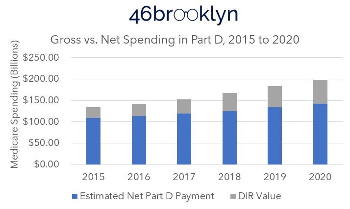
Figure 2
Source: Medicare Part D Dashboard (as of 3/27/2022); 2021 Medicare Trustees Report; 46brooklyn Research
Since 2015, the gross amount of money (before considering DIR) spent by Medicare Part D for prescription drugs has increased $64.8 billion ($133.82 B in 2015 to $198.65 B in 2020). But, we can also see in Figure 2 that each year the value of DIR gets greater and greater. This means that the tool used to control Medicare’s drug costs are increasingly not recognized at the pharmacy counter (which we, and we think CMS, view as a detriment to patients).
The 48% increase in gross drug expenditures appears disconnected from enrollment growth. The total number of beneficiaries with drug benefits in Medicare (Part D & Medicare Advantage combined) has climbed only 7.9 million (20%) over the same time frame (38.6 million combined in 2015 to 46.5 million combined in 2020) (Figure 3). Again, this is despite gross drug expenditures increasing by 48%.

Figure 3
Source: Medicare Part D Enrollment Data; 46brooklyn Research
Of course, all of the utilization in Medicare Part D is composed of various prescription drug products. Roughly 9 out of 10 of every product dispensed in Medicare Part D was a generic in 2020, as it has been over the last five years (Figure 4).

Figure 4
Source: Medicare Part D Dashboard (as of 3/27/2022); 46brooklyn Research
However, 8 out of every 10 dollars spent (in the gross) was spent on brand name medications in 2020. A number that, despite increasing generic entries (see above), continues to get larger each year. (Figure 5).

Figure 5
Source: Medicare Part D Dashboard (as of 3/27/2022); 46brooklyn Research
One of the key reasons for the growing spend in brand name medications is the growing role of specialty medications. Despite accounting for less than 1% of utilization, specialty drugs represent 38.6% of gross costs in 2020 (up from 0.6% of utilization and 28.2% of cost in 2015) (Figures 6 & 7).

Figure 6
Source: Medicare Part D Dashboard (as of 3/27/2022); 46brooklyn Research
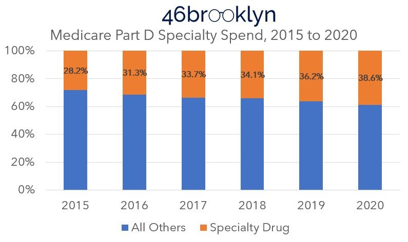
Figure 7
Source: Medicare Part D Dashboard (as of 3/27/2022); 46brooklyn Research
“Pharmaceutical companies alone set and raise drug prices.”
So where does that leave us?
Well, it seems that if we want to understand prescription drug expenditures in Medicare, we ought to start by looking into brands, and maybe specialty drugs. Clearly, getting the price right on those therapies is critical to getting the overall price to the program correct. Fortunately for us in attempting to keep this report short, the trade association for pharmacy benefit managers (PBMs), the Pharmaceutical Care Management Association (PCMA) has already offered an answer, by telling us that; namely, “pharmaceutical companies alone set and raise drug prices.”
Case closed, drug affordability solved.
Well despite that PCMA is basing their statement off an interpretation of a January 2022 CBO report, it’s probably best that someone at least check the work, because we have found drug pricing to be pretty complicated, and the nuance we have observed doesn’t generally lend itself to easy answers. So, rather than engage in a hollow dismissal of someone’s premise because of their backgrounds, we felt some good, transparent, data-based analysis may help confirm what’s actually happening with drug prices.
The basis of rising costs in Medicare Part D
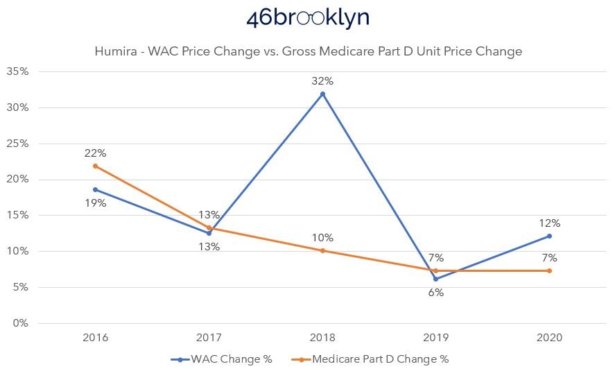
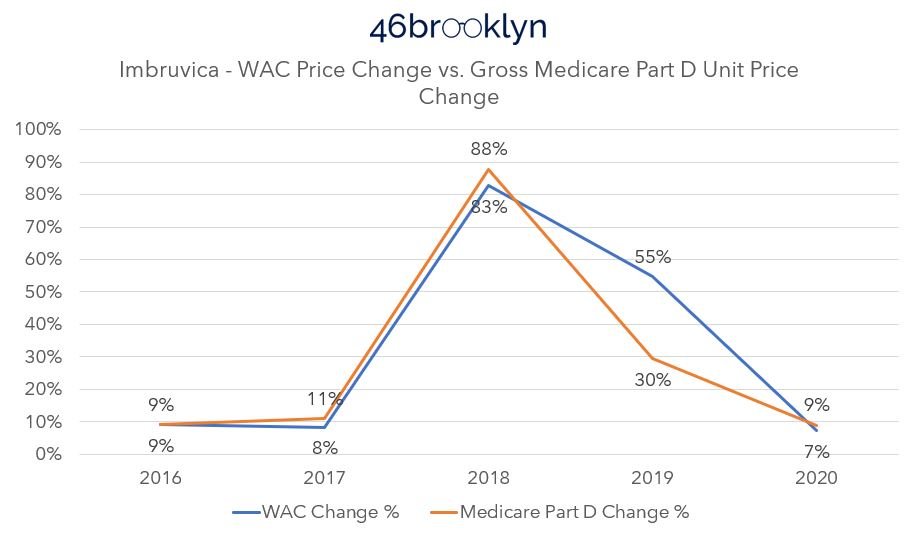
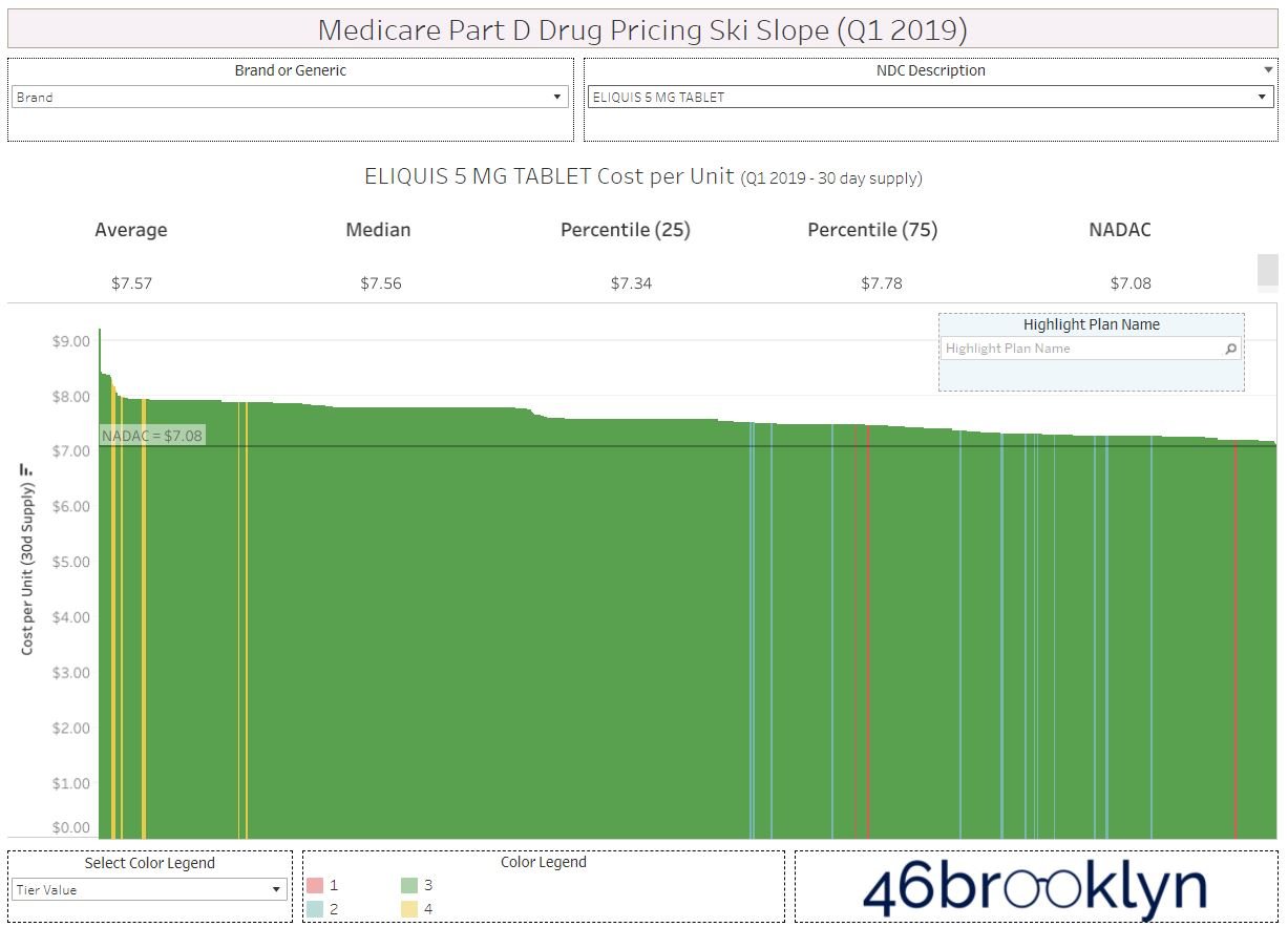
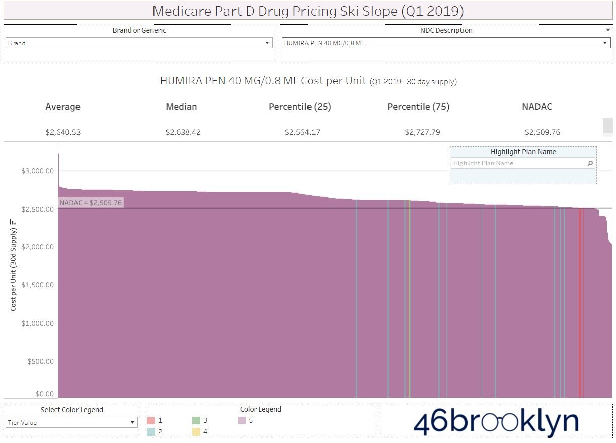
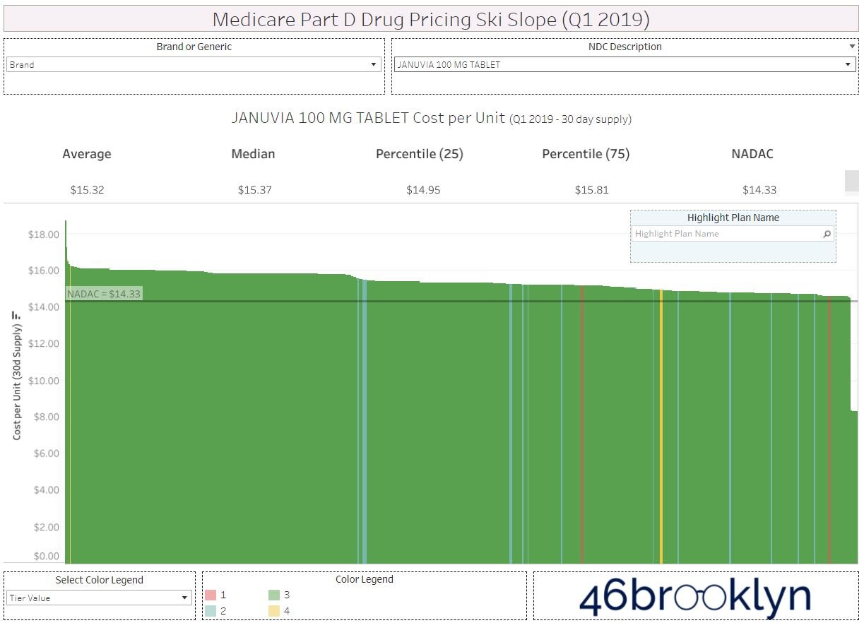
If, in fact, the sole parties responsible for rising drug costs in Medicare Part D are pharmaceutical companies, then a quick check of the top 10 drugs in Medicare Part D should be sufficient to check the PCMA conclusions derived from the CBO math, so to speak. According to the dashboard, the most costly Part D medications in 2020 were (in descending order) Eliquis, Revlimid, Xarelto, Januvia, Trulicity, Imbruvica, Lantus Solostar, Jardiance, Humira, and Ibrance (Figure 8). In total, these 10 medications represent a whopping $39.4 billion of gross drug expenditures in 2020 (or 20% of the overall gross spending).
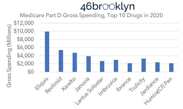
Figure 8
Source: Medicare Part D Dashboard (as of 3/27/2022); 46brooklyn Research
Four of the medications (Revlimid, Imbruvia, Ibrance, and Humira) would be considered specialty medications, while the others are not. And fortunately for us, all are medications which have been around since 2015. This means we can leverage our other data visualization, specifically the Brand Drug List Price Change Box Score, to see what kind of price changes these medications have undergone since 2015. If the change in price of the drug’s wholesale acquisition cost (WAC, the manufacturer list price which powers the Brand Box Score) matches the change in gross spending over time, then we would certainly concede that PCMA got it right and we’ve wasted a lot of time studying drug prices that aren’t manufacturer list prices at 46brooklyn.
However, if things don’t match up, then perhaps we should agree that drug pricing is a bit more nuanced than it appears, or at the very least, concede that other supply chain members beyond the manufacturer have the ability to set and raise drug prices too.
WAC price changes vs. Medicare Part D spending
Let’s start at the top with Eliquis, a medication we know well, having talked about it before. It’s also been a common punching bag for many of those who have bemoaned rising drug prices. While Eliquis is typically thought of as a Pfizer product (as they market it), it was borne out of a 2007 collaboration with Bristol Myers Scquibb, where today, Eliquis is listed under the Bristol Myers Squibb label, and if we go to our Brand Box Score, we can see that it has pretty consistently taken a price increase each and every year from 2015 to 2022 (Figure 9).
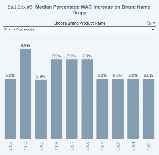
Figure 9
Source: Elsevier Gold Standard Drug Database; 46brooklyn Research
Note we confirmed the accuracy of the above with the use of Stat Box #7 in the Box Score visualization. We wanted to ensure that Eliquis was one of the medications that only took one price increase each year (as Stat Box #3 is measuring median, if more than one price increase occurred, we’d underestimate the impact of year-over-year price changes). Fortunately for us, Eliquis only took one price increase a year over the years we’re interested in (2015 to 2020), so we can proceed with using this drug for our analysis. Comparing the WAC pricing behavior to the average cost per unit for Eliquis in Medicare demonstrates a pretty close relationship between the two. Although the Medicare cost trending is slightly higher than the WAC behavior (Figure 10) it’s not lost on us that after years of disconnects in pricing, once both WAC and gross spending changes aligned (i.e., 2020) that shortly thereafter Eliquis started getting shoved off PBM formularies.

Figure 10
Source: Elsevier Gold Standard Drug Database; Medicare Part D Dashboard; 46brooklyn Research
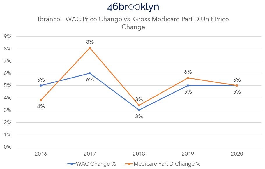
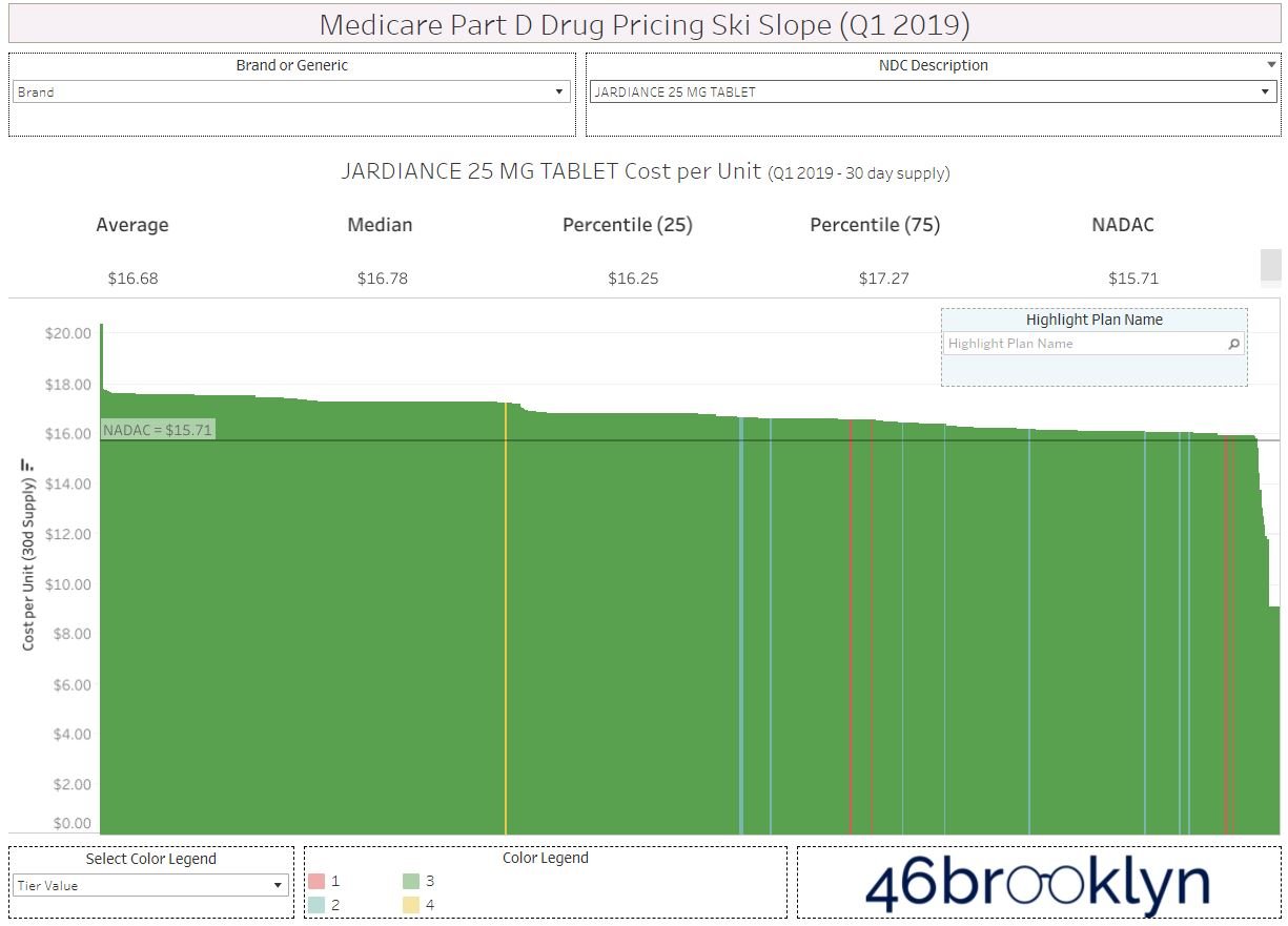
Now, the rest of the medications in Medicare Part D’s Top 10 for 2020 don’t play as nicely as Eliquis. This is because they take multiple price increases per year, and Stat Box #3 of the Box Score isn’t well equipped to track the annualized impact of those trends (because it is identifying the median price increase). Nevertheless, we can rely upon Stat Box #7 of the Box Score to effectuate the impact of the drugs that take multiple price increases per year to show the rest of the results for the top 10. We do this in the gallery below by considering the price in 2015 to have a value of 100 (i.e., 100% of the drug’s cost), and increasing the cost by the stated percentage in Stat Box #7 for all price increases in a given year. Not ideal, but this is the level of drug pricing transparency offered us today.
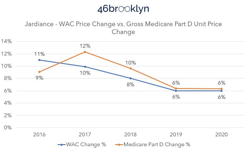

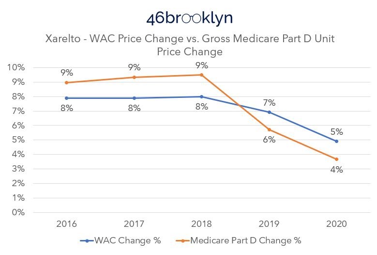
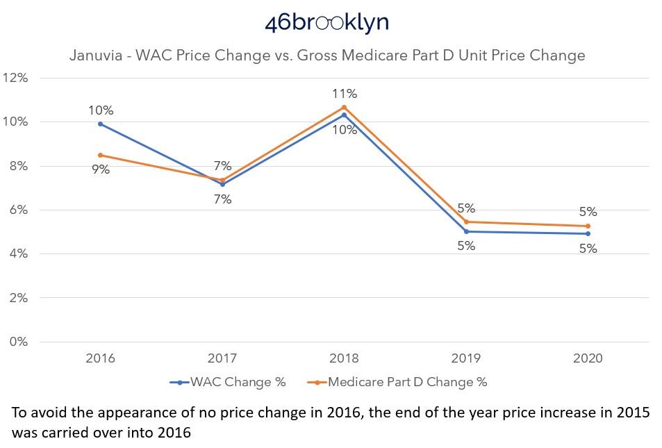
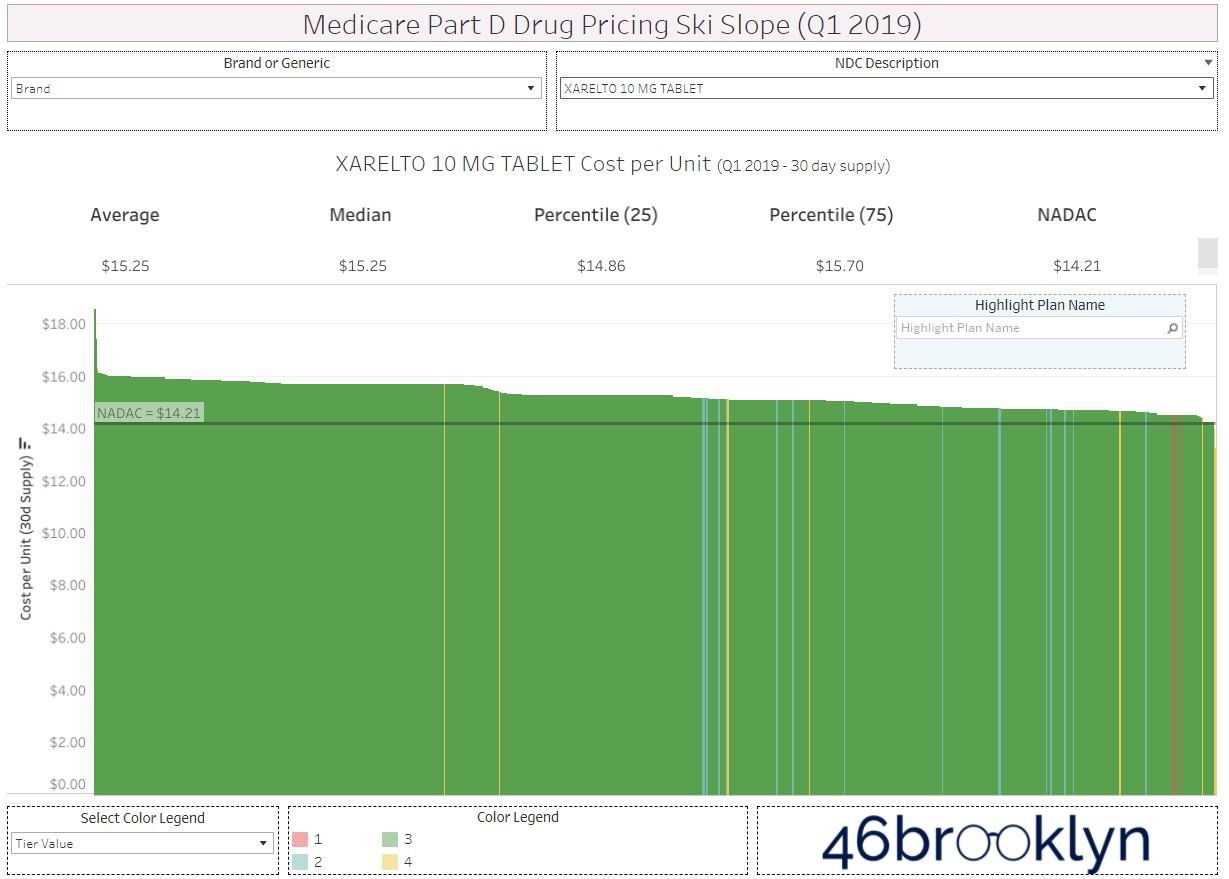
Scrolling through the gallery, we see some more Medicare Part D drugs that seem to follow what Eliquis taught us. Januvia’s WAC changes trend very closely to Medicare cost trends, as does Xarelto. Except of course with Xarelto, for whatever reason Medicare cost change behavior switches from 2018 to 2019 (Figure 11). Rather than Medicare costs trending slightly above WAC, as they did consistently for Eliquis, they all of a sudden trend below WAC in 2019 going forward. Why is that happening if there is only one answer to why drugs cost what they do? Why aren’t we getting the same answer as Eliquis with Xarelto when both medications are in the same therapeutic class (i.e., Factor Xa inhibitors)?

Figure 11
Source: Elsevier Gold Standard Drug Database; Medicare Part D Dashboard; 46brooklyn Research
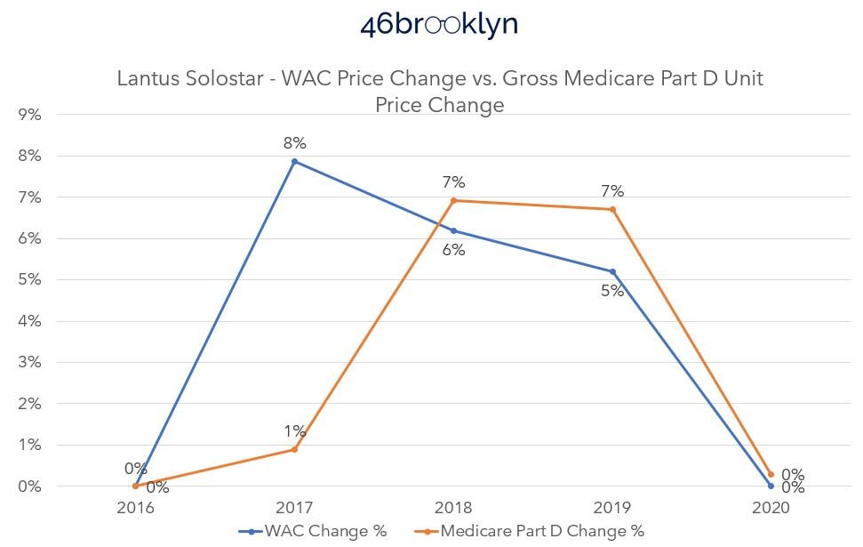
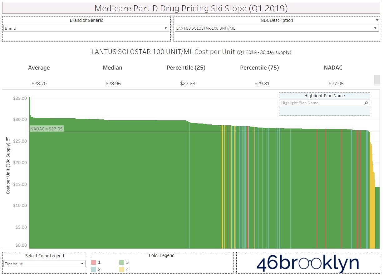
Well if Xarelto is confusing, take a look at Lantus Solostar (Figure 12). Why is the Medicare price trend so delayed in recognizing the WAC price increases in 2017? Again, we are looking for the same answer across the board, and this suggests that the plan sponsor took the price increase on the chin, so to speak. Thank you plan sponsors, but doesn’t that mean you impacted price trends beyond what the manufacturer did? And giving credit where we think credit may be due, doesn’t that mean that you impacted the trend in a positive manner; protecting the patient from a higher cost increase that the manufacturer directed through its price changes?

Figure 12
Source: Elsevier Gold Standard Drug Database; Medicare Part D Dashboard; 46brooklyn Research
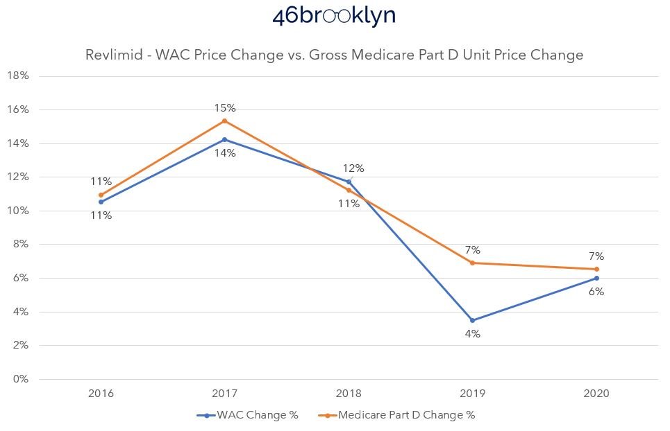
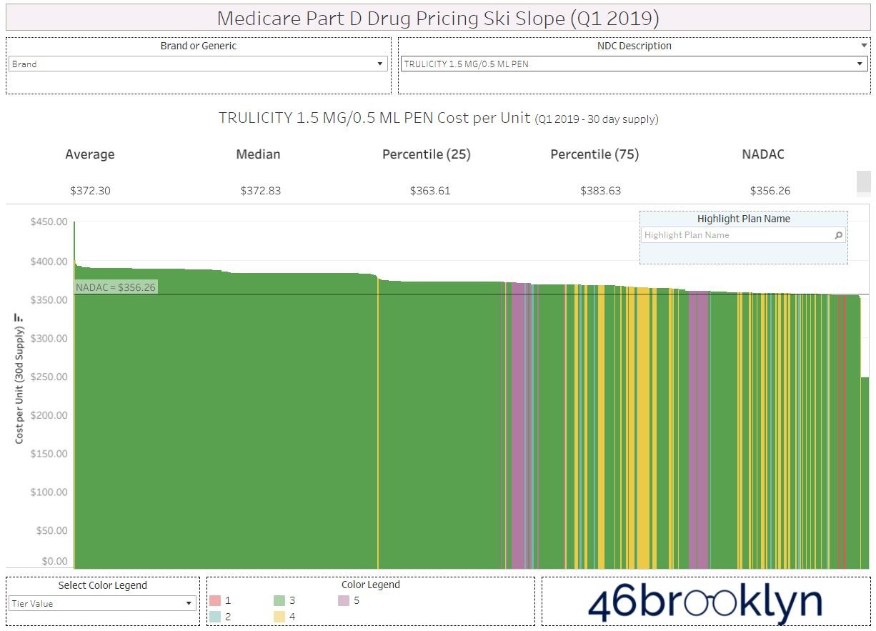
But it’s not all sunshine and rainbows. Take a look at Trulicity (Figure 13). Medicare took double the price increase in 2017 than what the WAC price alone would tell us was appropriate. What gives? We were told the test was going to be easy, and this doesn’t seem like an easy or straightforward test of drug price cause and effect.
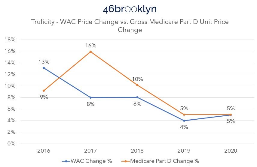
Figure 13
Source: Elsevier Gold Standard Drug Database; Medicare Part D Dashboard; 46brooklyn Research
As PCMA would have us believe, there is one answer for who is responsible for drug affordability challenges: the drug manufacturer.
While the above pricing data trends don’t support PCMA’s contention, we’d be the first to acknowledge that our analysis thus far is subject to some limitations.
First, it’s obviously well worth noting that we are analyzing list prices versus gross Medicare spend – both of which are severely impacted by massive discounts and concessions that are negotiated behind the scenes that make actual pricing disconnect analyses far more complex than what we’ve done here.
That said, there is still great value to this type of study, as it can help better separate fact from fiction and provide needed context in the great drug pricing debate.
So beyond the rebate and discount limitations, for the sake of this research and its possible shortcomings, we are treating each WAC price increase as effectively a single event, even though not all price changes occur at the same time. Consider that when we are measuring Medicare’s price change behavior, what we’re really measuring is the average price for the drug, in Medicare, across all the various NDCs, strengths, plans, and dates the prescriptions were actually dispensed. We are taking that average price each year, and calculating a percent difference year-over-year off those averages. In comparison, our WAC price change tracking is more a moment in time comparison. For example, our analysis treats a manufacturer who took a WAC price change for their drug in January the same as a manufacturer who took a price change in July. For the January price change events, it is pretty reasonable to assume that had an equal impact on all claims throughout the rest of the year, but that is probably not a fair assessment for price changes that came later. If you go through the gallery, we did our best to give credit for these types of events when we moved Q4 price increases into the following year in terms of measuring impact (see Januvia). And while we feel we did a good job making these reasonable data accommodations – and the learnings above are interesting if for no other reason than that some drugs’ Medicare cost behavior is below WAC and others are above – we are willing to concede that there are data limitations in what we’re trying to compare.
That said, let’s return to what the Medicare prices are really measuring. As stated, the above charts are tracking the average prices for the drug over time. And part of what those ‘averages’ include are the various plans that offer Medicare to American seniors. In 2020, the average Medicare beneficiary had a choice of over 50 Medicare plans (28 stand-alone Part D plans, 24 Medicare Advantage plans). It is probably fair to characterize that as a lot of healthcare choices. However, we’ve already explored how those choices can impact Medicare beneficiaries before at 46brooklyn.
If you’re not familiar with the 46brooklyn Medicare Part D Drug Pricing Ski Slope visualization, what that tool does is document a drug’s price across the various Medicare plan options that exist within a given quarter of Medicare data. Imagine our surprise then, when in gathering the images for the top 10 brand drugs in 2020 (gallery below), we noted that across the numerous Medicare plans that exist, the reported price for the drug was not the same. How can we explain such variability in price for these brand products given each having just one manufacturer offering just one manufacturer price (i.e. WAC) to the market (regardless of how we deal with the weighting in any given quarter)?
Again, the Medicare data as reported by the plan sponsors is itself an aggregate. Meaning it also has limitations, just like what we saw when we dug deeper into the WAC experience before. Regardless, the simple answer offered by PCMA does not hold up based upon a quick check of just the top ten drugs in Medicare Part D in 2020 by spending. For whatever reason, some drugs followed the trend (as defined by Eliquis) and some bucked the trend, and the fact that the trending wasn’t predictable based upon the WAC, or the manufacturer set-price, alone leads us to believe that their conclusion was wrong.
There are no quick answers and no single source for drug pricing dysfunction
To be clear, at least within the top 10, the majority of brand drug costs – representing around a fifth of all Medicare Part D costs – trended pretty close to the WAC price trend as to almost be unnoticeably different (so long as we’re comfortable with say a 5% error rate). Those trends support PCMA’s contention, but there is reason to doubt that the answer to drug affordability is so easily explained away by the quick answers offered by PCMA.
At the risk of piling on, let’s perform the same analysis with the most utilized therapies (i.e., generic drugs) in Medicare Part D. This time, instead of relying upon our Brand Box Score, we will use the drug’s national average drug acquisition cost via our NADAC Drug Pricing Dashboard to get a sense for what is happening with generic drug costs over time. According to the Part D dashboard, the most utilized therapy in Medicare in 2020 was atorvastatin (generic Lipitor). Specifically, there were 58 million atorvastatin claims in 2020 dispensed to more than 18 million Medicare beneficiaries (roughly one in four). We can quickly get the NADAC pricing trends for atorvastatin off of the 46brooklyn NADAC tool (Figure 14).
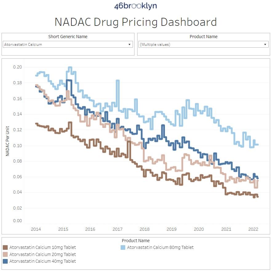
Figure 14
Source: CMS NADAC; 46brooklyn Research
The first thing we notice is that our NADAC pricing dashboard tracks the price of the various strengths of atorvastatin over time. The most expensive strength (80 mg) carried a cost of $0.1755 per unit in January 2015, which declined to $0.1578 per unit by December 2015. We sadly have to rely on the most expensive strength for atorvastatin, because CMS doesn’t provide more detail in Medicare Part D spending data than an aggregate drug name. We select the highest cost version in the interest of being conservative in our analysis. But whichever price we rely upon for 2015, the atorvastatin NADAC is half the average price reported per unit in Medicare Part D for atorvastatin in 2015 (i.e., $0.34 per unit).
While it is true that Medicare Part D costs for atorvastatin have declined over time, they do not match or correlate with the decreases in price of the drug according to NADAC. In Figure 15, we compare the reported unit price in Medicare to the 80 mg atorvastatin NADAC price (i.e., the highest cost) based upon the average reported NADAC price for the drug in the year. When then compare the year-over-year percentage changes to each other, we can see the disconnect between changes in the drug’s price and the changes of price in Medicare Part D.

Figure 15
Source: CMS NADAC; Medicare Part D Dashboard; 46brooklyn Research
Specifically, when we look at the figure above, we see from 2015 to 2016, the price behavior as measured by NADAC decreased 15%, but there was no change in the Medicare cost. However, the next year the Medicare price decreases more than the decrease in NADAC. In the following year, the Medicare price comes down slightly despite no change in NADAC. What a wild couple of years for the most utilized drug in Medicare Part D. In 2020, more than 18 million Part D beneficiaries relied upon atorvastatin, and based upon Figure 14 above, the NADAC is going to take an 18% decline in price from 2020 to 2021. And despite that dramatic price decrease (the most pronounced dip in our reviewed time frame), we have no idea what the price experience for seniors will be in 2021 based upon this historic trending. And it shouldn’t be that hard to predict if there was only one party – that is drug manufacturers – who are responsible for drug prices in this country.
Now, PCMA or others may say that NADAC doesn’t reflect a manufacturer-set price point, and so the above isn’t relevant to the matter at hand. We would agree.
Pharmacies don’t buy from manufacturers directly in most instances; rather they buy from wholesalers. As a result, the wholesaler-set prices for the drug matter to them more than the manufacturer price. And even then, the manufacturer price (i.e., WAC) may not be directly correlated to NADAC either. To demonstrate, we will add the average WAC price trend change percentage for atorvastatin tablets (based upon the same dataset we rely on for our brand box score) to the figure above to create a more complete view of the pricing paradigm for this drug (Figure 16).

Figure 16
Source: Elsevier Gold Standard Drug Database; Medicare Part D Dashboard; 46brooklyn Research
In reviewing Figure 16, neither the WAC nor the NADAC were perfect predictors of Medicare’s cost experience for the most utilized drug in Part D. And while adding in WAC certainly makes Figure 16 a little difficult to understand, that is exactly the point!
If drug costs were solely the result of one party’s singular actions, surely we would be able to demonstrate that pretty reasonably by looking at either the most expensive or utilized therapies in Medicare, but we cannot. To pile on – because given the season, we might as well go full WrestleMania mode at this point – look what happens when we add average wholesale price (AWP) into the equation (Figure 17).

Figure 17
Source: Elsevier Gold Standard Drug Database; Medicare Part D Dashboard; 46brooklyn Research
If you’re not familiar with AWP, it could also be characterized as a manufacturer-set price (particularly for generics). If you consult our handy 46brooklyn glossary, AWP is “a prescription drug pricing benchmark that estimates the average price paid by a retailer to buy a prescription drug product from a pharmacy wholesaler.” More importantly, AWP is often the price that dictates the contract terms between the PBM and payer or even PBM and pharmacy. As AWP price trends, so does payment.
Well, imagine if we were a Medicare plan sponsor who contracted with a PBM for a three-year term from 2015 to 2017. If we are paying for generic drugs, like atorvastatin, based upon an AWP-linked contract over this time frame, maybe it is reasonable to conclude that our price went up due to manufacturer-set price behavior. So that would support PCMA’s contention for such a payer, but are we satisfied with that answer? Look what happened to the NADAC price of the drug over the same time frame (Figure 14). While our AWP cost basis would have increased 50% over the three-year term, the NADAC price (at the highest cost basis, 80 mg strength) decreased 22%.
Are PBMs so blind to what is actually going on with the drug’s acquisition price that they’re just paying pharmacies more for this drug because the manufacturer told them to?
We think not and can demonstrate.
Let’s take a brief pause on Medicare for a moment and look at the Medicaid managed care price for atorvastatin in Q2 2020. Again, this is the same drug as is used in Medicare and many of the same PBMs that have Medicare contracts also have Medicaid managed care contracts. In looking at the pricing behavior for this drug across the country, we see that the NADAC price was $0.13 per unit, but some states paid as little as $0.08 per pill whereas others paid as much as $0.50 per pill (Figure 18). How can we reasonably explain a six-times difference in the price across these various states?
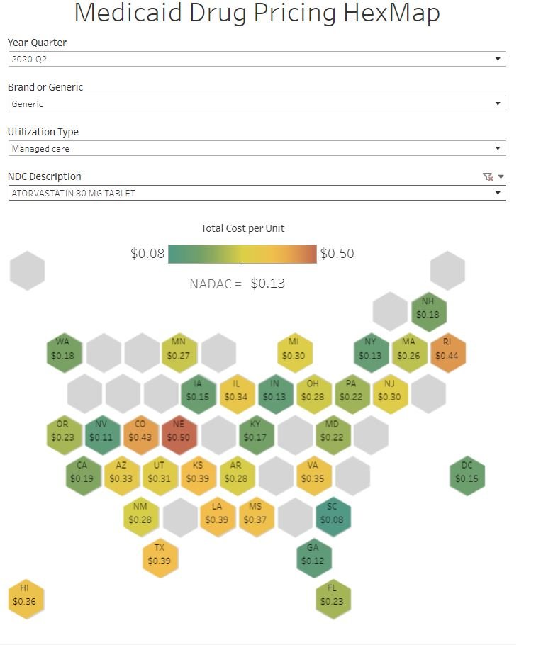
Figure 18
Source: Elsevier Gold Standard Drug Database; CMS SDUD; CMS NADAC; 46brooklyn Research
Perhaps if we were a pharmacy and we simply looked at what our contract says the price for a drug will be for the purposes of PBM reimbursement, we would understand what the source of drug pricing dysfunction really is. And while the contract can be incredibly difficult to access, we can all but guarantee it says something along the lines of that a drug’s price is the lesser of: (1) the pharmacy’s usual and customary charge (U&C), (2) the PBM-set maximum allowable cost (MAC) rate for the drug, or (3) an AWP-linked discount guarantee (i.e., drug manufacturer price).
If only one party was responsible for the drug’s price, and that party was the manufacturer, why are we asking for the lower charge of what the provider is willing to charge (i.e., the usual and customary) and why are relying upon the PBM to derive a payment maximum allowable cost? At the very least, those functions should be unnecessary if only the drug manufacturer’s price was what mattered.
The fundamentals haven’t changed
We already have some insight into what may be going on here, and it has little to do with the price the manufacturer sets and a lot to do with the pricing set by other drug supply chain intermediaries. In Deserving of better: How American seniors are paying for misaligned incentives within Medicare Part D, 3 Axis Advisors (Disclosure: the 3 Axis Advisors team powers the analytics and work here at 46brookyn) observed that even when the drug’s manufacturer-set price is held the same, the underlying value of gross drug costs can go up over time in Medicare Part D (Figure 19). The 3 Axis study attributed this to retrospective non-manufacturer price changes to drugs that occur in Medicare Part D, because CMS has itself acknowledged the role that “clawback” behavior has on drug costs.

Figure 19
Source: 3 Axis Advisors; Deserving of Better

Source: 9GAG
This isn’t the first time we’ve explored Medicare drug spending trends at 46brooklyn. Of course, nothing has really changed in Medicare since we wrote those last reports. Sure, some new drugs have appeared, some old drugs went generic, and the dollars and utilization have changed to reflect that. But the crux of what we study in drug data hasn’t changed, and so our story is largely a repeat of past story lines rivaling some of the best money grabs from Hollywood (cough Star Wars Episode 7 cough).
And in a word it is all very discouraging.
We have, as a nation, dedicated a lot of resources trying to get drug pricing right. When you try and count the amount of hours spent via legislative hearings (both at the state and federal level), alongside the amount of time by researchers (both academic and by the media) into studying this issue, the number gets very high, very fast. And all that is before factoring the amount of time doctors, pharmacists, nurses, and patients spend trying to find affordable medications. According to our own website’s analytics, we collectively spent nearly 4,000 hours together just last year (2021) on the topic and nearly 2,000 of you have already tuned in to our podcast. Despite all that, complexity, misunderstanding, and dysfunction persists – dysfunction that many players share responsibility in creating.
We present all of this to you today not in some full-throated defense of drug makers. Hardly. We proceed down this proverbial rabbit hole to showcase that drug pricing is far more complicated than some hope it to be, or perhaps more appropriately, far more complicated than some hope you’ll ever realize.
The truth is that we have an incredibly complex drug supply chain, a bevy of ways to quantify price, tremendous opacity, and more hidden nooks and crannies inside it than an English muffin factory. Every entity in the drug channel has a role in influencing and inflating the prices we pay for medicines, and with what we learned – and continue to learn – in our home state of Ohio, PCMA and their members know better than to spread pricing fiction.
So how can it be that a CBO report formed the basis of a PCMA statement that the data we reviewed today doesn’t support? More broadly, how can it be that the argument against measures to reduce drug costs are presented as this dichotomy between either securing lower premiums or recognizing lower drug costs? In what other forms of insurance does a cheaper service (i.e., lower drug cost) require a higher premium in order to cover the risk? Are there perhaps other CBO assessments that need recalibrated? Will the FTC end up being the Chosen One?
Try as we might, after all these years, we still don’t have the all answers. But these are the types of questions that keep us up at night because today, someone will go without the insulin they need because they can’t afford it. Someone else will forgo participation in a school sport because they can’t afford the medication to control their asthma. And still someone else will not even give themselves a chance at beating cancer because they don’t want to be a financial burden to their family in what will become their final days due to not taking the financial risk for a treatment that can’t be guaranteed to extend their life.
These are the collective stories we’ve experienced in the field of pharmacy each and every day. We hope these are not your stories. However, we know that at some point we all will come face-to-face with the US healthcare system. That is why we asked ourselves what we could buy with $200 billion. Are we getting our money’s worth knowing that drug costs are inflated state-to-state, health-plan-to-health-plan? Are we certain that given 50 or more options to buy Medicare drug coverage, we will buy the best one for our needs? What do measures of healthcare equality look like when the price I pay is different than the price you pay, even if we go to the same pharmacy, for the same drug, on the same day? Shouldn’t there be answers to these questions that are easily reproducible and verifiable?